

There is a piece of advice about nude dressing that circulates everywhere, and there is a second piece of advice that directly contradicts it. The first says your nude should sit within a shade or two of your own skin so the effect is smooth and uninterrupted. The second says a nude dress should be clearly lighter or darker than your skin so that people can tell you are wearing a dress at all. Both pieces of advice are correct, and the reason they seem to conflict is that they apply to different garments. Getting this distinction right is the whole difference between a nude dress that looks refined and one that looks like a mistake. This guide explains what nude actually means now, how to find your shade, why the rule for a dress is the opposite of the rule for shoes, and how texture does the work that color normally would.
What nude actually means now
For most of the last century, nude in fashion meant one specific shade: a pale, slightly pink beige that happened to approximate the skin of a narrow slice of the population. Everyone else got the same color and a poor result. That definition has changed, and the practical consequence for anyone shopping today is that nude is now a family rather than a color.
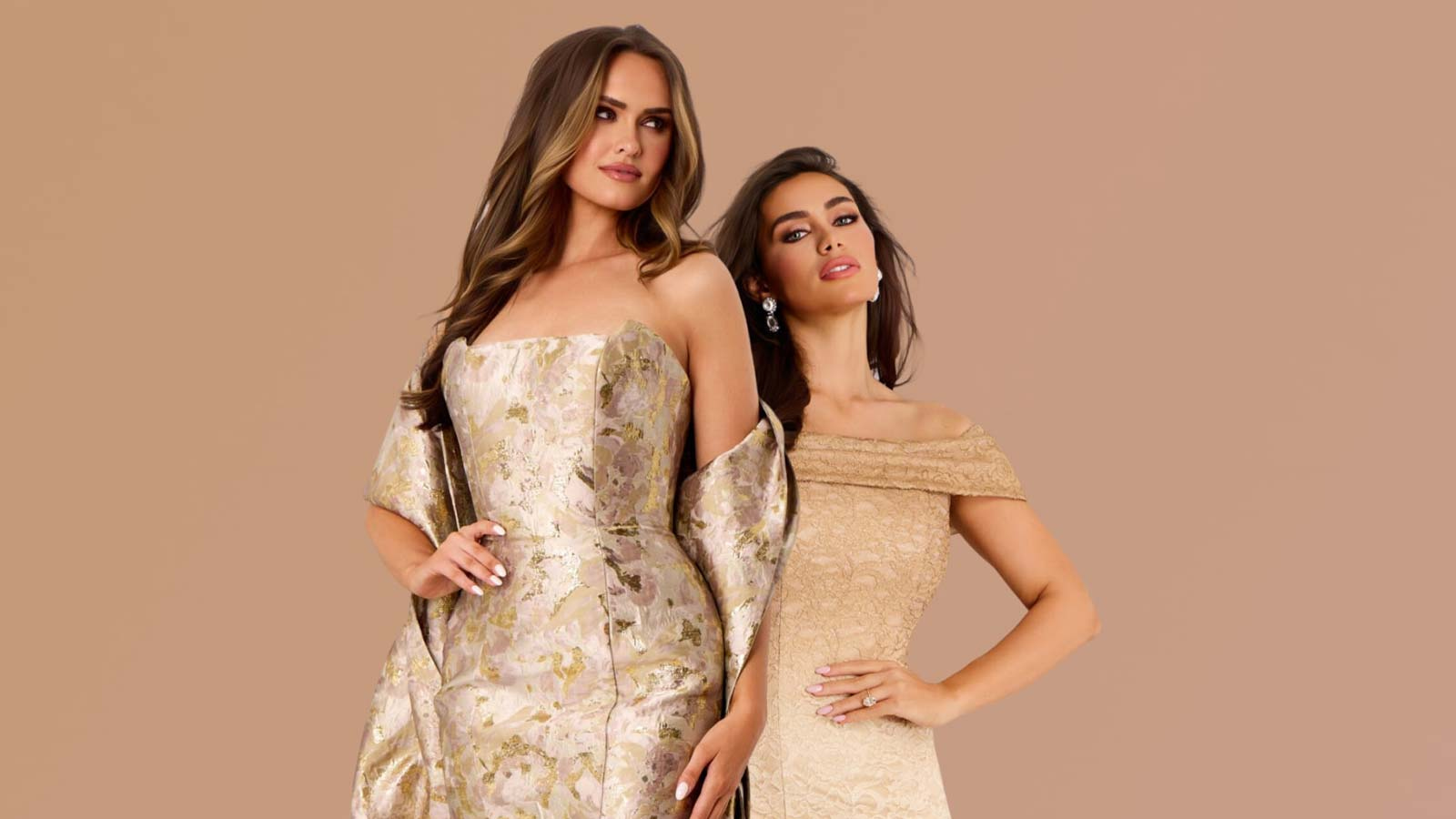
The modern range runs from the palest ivory and blush through champagne, sand, tan, caramel, and toffee, down to deep bronze, mocha, and espresso. What unites them is not the pigment but the intent: a nude shade is one that relates to skin rather than contrasting with it, sitting in the warm neutral family instead of announcing itself as a color. This is why two people can both be wearing a nude dress and be wearing shades that look nothing alike.
The practical takeaway is that if a shop, a site, or a friend refers to nude as though it were one color, they are working from the old definition and their advice will not transfer. Your nude is a specific point on a long scale, and finding it is the entire exercise. The range of nude mother of the bride dresses shows how wide that family is in practice.
Why the rule for a dress is the opposite of the rule for shoes
Here is the contradiction resolved, and it is the single most useful thing to understand about wearing nude.
Accessories should match your skin as closely as possible
A nude shoe, a nude undergarment, or a nude illusion panel is trying to disappear. A shoe matched closely to your skin depth continues the line of the leg rather than cutting it off, which is why a well-matched nude heel makes the leg look longer while a mismatched one looks like a pale block at the end of your foot. An undergarment matched to your skin vanishes under a light fabric. In every one of these cases the goal is invisibility, and invisibility requires the closest possible match, generally within a shade or two of your own coloring. This is where the advice about matching exactly comes from, and for accessories it is entirely right.
A dress needs deliberate distance from your skin
A dress has the opposite job. A dress covering most of your body in a shade identical to your skin does not read as elegant; it reads as an optical illusion, and not a flattering one. From a distance, in a photograph, or under a camera flash, the boundary between fabric and skin disappears and the effect is unsettling rather than refined. This is why the second piece of advice exists, and for a garment this size it is the correct one. A nude dress should sit clearly lighter or clearly darker than your own skin, so that the eye can read where the dress ends and you begin. Two or three shades of separation is usually enough. For fair skin, that generally means going deeper into caramel, tan, or bronze. For deeper skin, it often means going lighter into champagne, sand, or soft ivory.
The most common nude mistake
The single most frequent error in nude dressing is wearing a pale pink-beige because the label says nude, regardless of whether it relates to your own coloring at all. On anyone whose skin is more than a couple of shades deeper than that default, the result reads as chalky, ashy, and disconnected, as though the dress belongs to a different person.
The failure is not that the shade is pale. A pale nude can be beautiful on deeper skin precisely because the contrast is deliberate. The failure is that the shade was chosen by the label rather than by looking. If a nude reads gray or dusty against your skin rather than warm, it is the wrong nude no matter what it is called.
Undertone is the second half of the problem. Nude shades carry undertones just as skin does. A pink-based nude sits comfortably against cool undertones and can look sallow against warm ones. A golden or peachy nude flatters warm undertones and can look slightly orange against cool ones. Matching the undertone matters more than matching the depth, because depth is easy to see and undertone is what makes a shade look right or subtly off. The guide to the best dress colors for your skin tone covers how to identify your undertone in the first place.
How to test a nude shade properly
Testing nude is different from testing any other color, because the comparison you need is against your own skin rather than against a general sense of what suits you.
Do it in daylight. Artificial lighting shifts neutral shades more than it shifts saturated ones, and store lighting in particular is often warm enough to make a mismatched nude look acceptable. Take the dress or the swatch to a window.
Hold it against the part of your body the dress will actually sit on, which usually means the chest and shoulders rather than the inside of your wrist or the back of your hand. Those areas differ from the torso in both depth and undertone often enough to give a misleading answer.
Then step back and look in a full-length mirror rather than examining it up close. Nude either works or fails at conversational distance, and a shade that looks fine at arm’s length can collapse into your skin at three meters. Photographing yourself in it is genuinely worth doing, since a camera flattens the distinction between fabric and skin more than the eye does, and a nude dress that survives a photograph will survive anything.
Why texture matters more in nude than in any other color
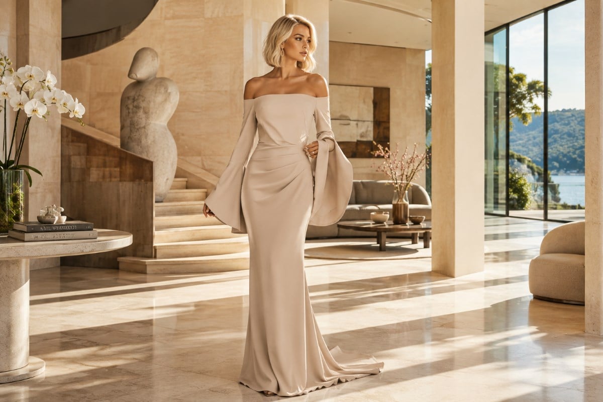
A nude dress asks a fabric to do something no colored dress asks of it. In a red or emerald gown, the color carries the visual interest, so a plain fabric can be entirely sufficient. Strip out the color and something has to replace it, or the dress reads as flat.
This is why the most successful nude dresses are rarely plain. Lace, beading, sequins, embroidery, appliqué, pleating, ruching, and even a pronounced weave all supply the dimension that color would otherwise provide. Beading on a nude ground is especially effective, since the beads catch light against a matte surface and create depth without adding a second color to the equation.
Fabric choice does similar work. Satin gives a nude dress a sheen that separates it from skin. Velvet gives it depth and a light-absorbing surface. Crepe gives it a matte, tailored quality. A completely flat, thin nude fabric is the hardest version to wear well, because it has neither color nor texture doing any work. The styles among beige evening dresses show how texture and finish change a neutral gown.
Beading and lace do the heaviest lifting
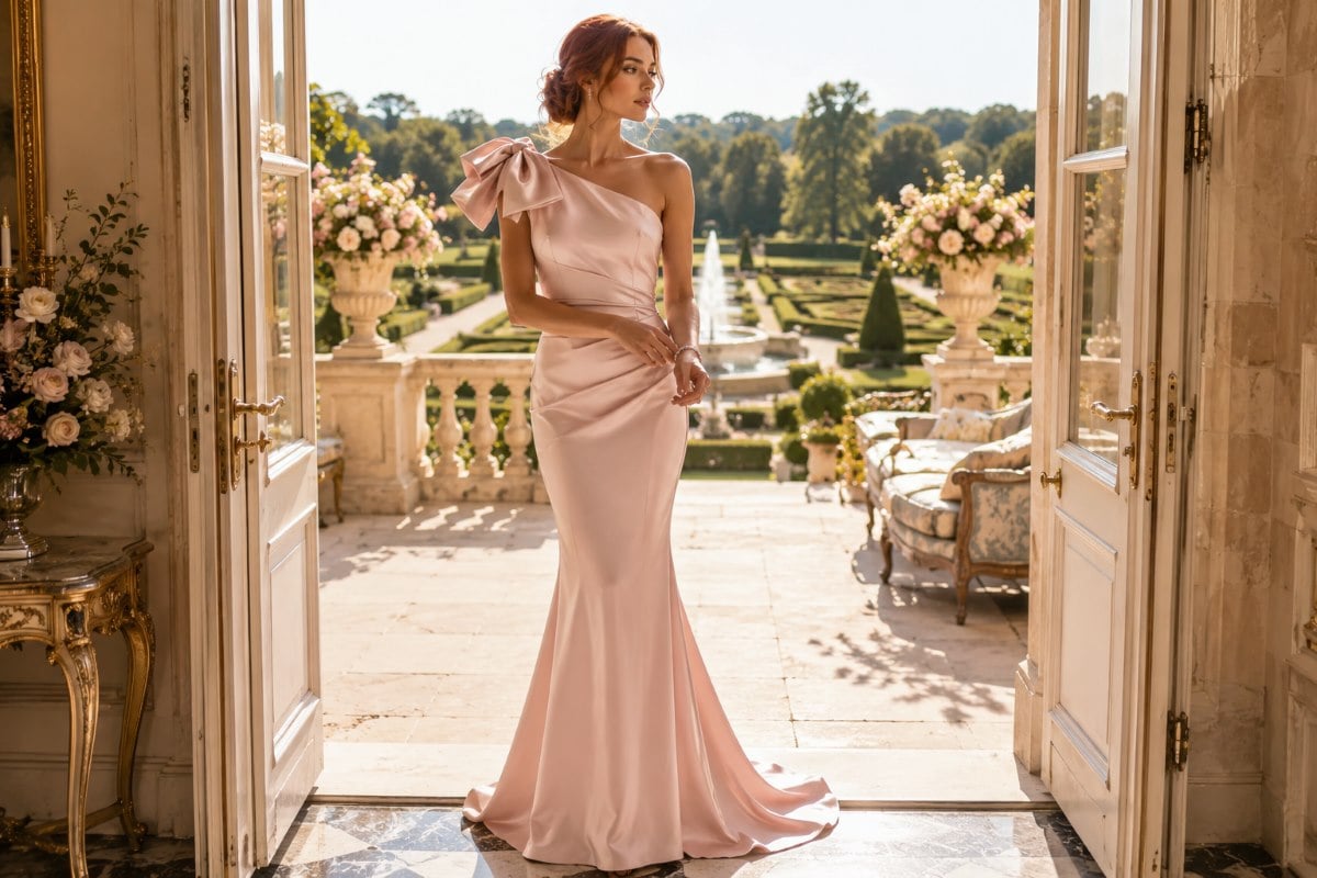
Of all the ways to add dimension to a neutral, applied surface detail is the most effective, because it introduces both texture and light. Lace over a nude ground creates a pattern in shadow rather than in color, which is subtle at a distance and rich up close. Beading and sequins catch light in points against a matte surface, so the dress changes as you move without ever introducing a competing shade. Embroidery adds a raised line that photographs with depth. In each case the interest comes from how the surface handles light rather than from pigment, which is exactly what a nude dress needs.
Fabric weight changes how a nude reads
Beyond applied detail, the cloth itself matters more in nude than in a strong color. A heavier fabric with body reads as substantial and expensive, while a thin, flat one can look insubstantial precisely because there is no color drawing the eye away from the fabric. Satin separates itself from skin with sheen, velvet with depth, and crepe with a matte tailored surface. The version to avoid is a lightweight, unstructured fabric with no finish and no detail, since that combination gives the eye nothing at all to read.
What a nude dress does that other colors cannot
There are specific reasons to choose nude rather than simply reasons not to avoid it. The first is line. Because a nude dress does not create a hard visual boundary at the hem or the neckline, it produces a long, continuous silhouette, and paired with a shoe in a related tone the effect is really elongating.
The second is that nude reads as expensive when it is done properly. Without color to distract, everything else about the dress becomes visible: the cut, the quality of the fabric, the precision of the seaming, the placement of the beading. This cuts both ways, since a poorly made nude dress also has nowhere to hide, but a well-made one looks considerably more costly than the same design in a bold color.
The third is versatility with accessories. A nude dress functions as a neutral ground, so it takes gold or silver, bold jewelry or minimal jewelry, and a statement shoe or a matched one, without any of the clashing risks a strong color carries. The range of cocktail and party dresses shows how a neutral behaves at a shorter length, where the elongating effect is less relevant and the sophistication of the shade does the work.
Where a nude dress works and where it does not
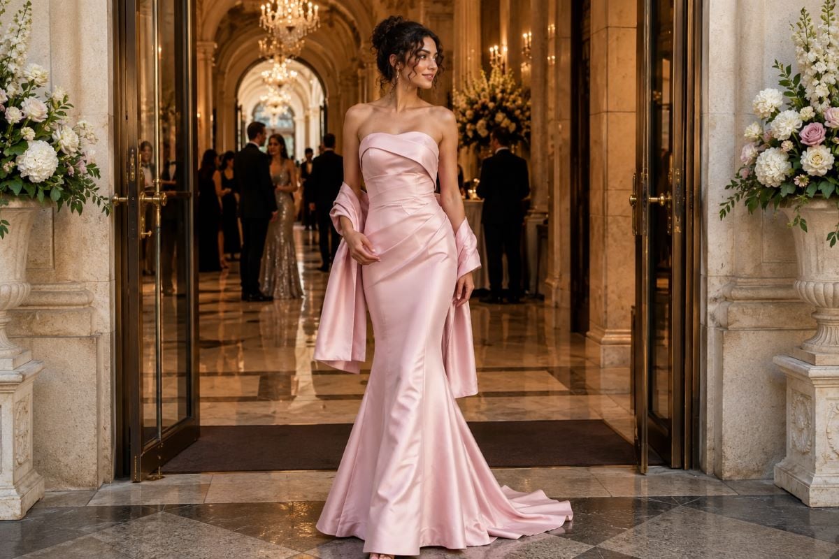
Nude suits a formal evening event particularly well, where the long line and the light-catching detail read as refined. It suits a cocktail party, a gala, and a red-carpet-style occasion. It suits the mother of the bride or groom, since it coordinates with almost any wedding palette without competing.
The one place it needs real care is a wedding where you are a guest. Champagne, ivory, and pale blush nudes can read as bridal in photographs, particularly against a white background or in a group shot beside the bride. A deeper nude in caramel, bronze, or toffee avoids the problem entirely, and if you want a pale nude at a wedding it is worth checking against the bride’s dress rather than assuming the difference will be obvious to a camera.
The second consideration is sheerness. Some nude fabrics, particularly lighter ones, are less opaque than they look on a hanger, and a nude lining behind a nude fabric can read as skin under bright light. Checking the dress in strong light before the event, and choosing foundation garments deliberately, prevents an easy mistake. The advice on what to wear under a sheer dress applies directly.
Styling a nude dress
Because a nude dress is a neutral ground, styling it is more open than styling a colored one, and there are three reliable directions.
The monochrome approach keeps everything in the same tonal family: a nude shoe, a nude or metallic bag, and jewelry in a matching metal. This produces the longest, cleanest line and the most modern result, and it works best when the fabric has enough texture to carry the look on its own.
The metallic approach treats the nude as a base and adds gold or silver at the jewelry, shoe, and bag. Gold suits warm nudes and deeper skin tones especially well; silver suits cooler, pinker nudes. This is the safest formal option and the one that reads most obviously as considered.
The contrast approach adds one strong color as an accent, most often at the lip, the shoe, or the bag. A red lip against a nude dress is a classic for good reason, since the nude recedes and the accent advances. The important discipline here is to choose one accent rather than several, because a neutral dress with three competing accents loses the calm that made nude worth choosing. For more on how a neutral behaves across formal silhouettes, the piece on the beige evening dress covers the closely related shade.
Getting the shade right the first time
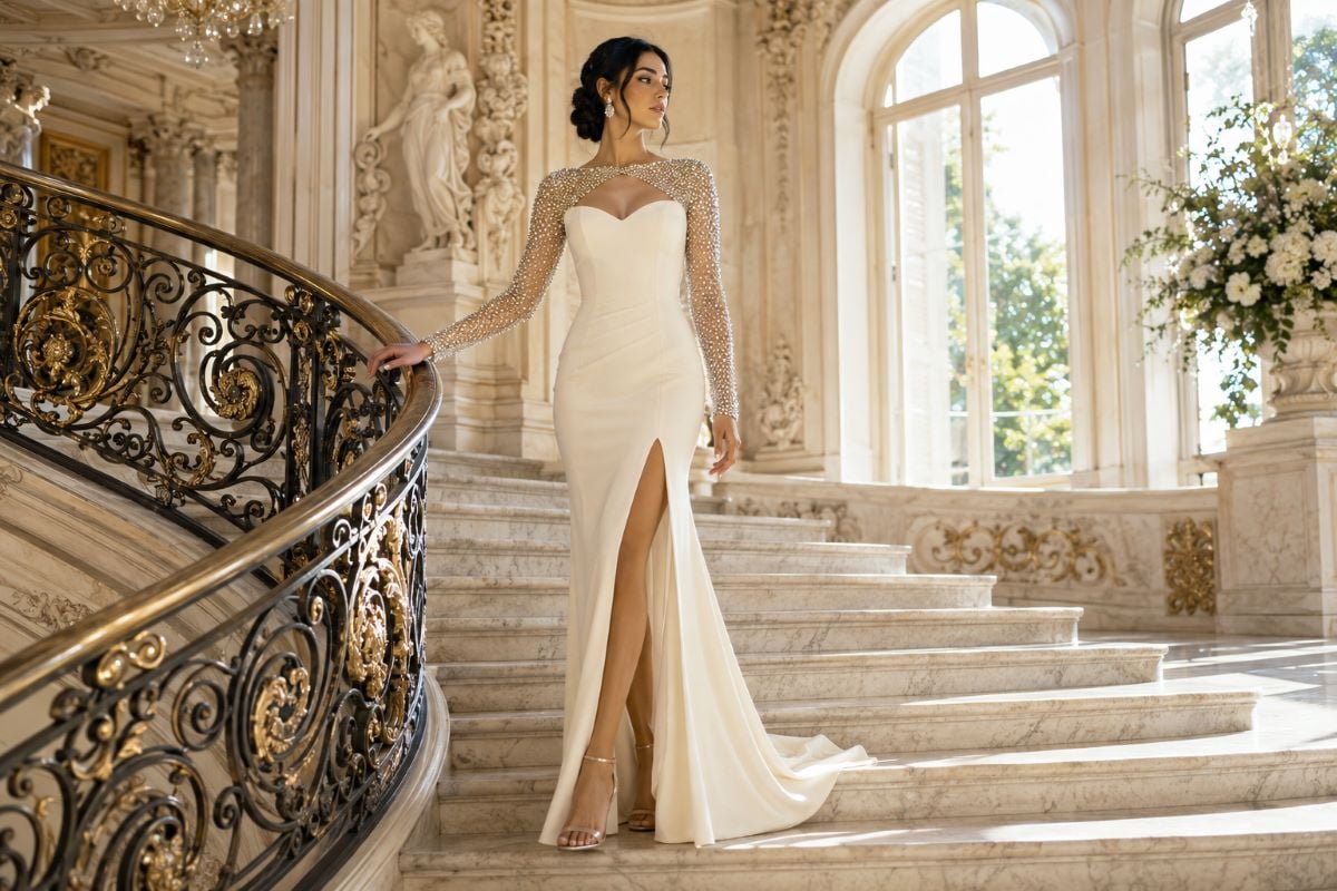
The whole decision comes down to four things. Choose a shade with two or three shades of separation from your own skin, in either direction, so the dress reads as a dress. Match the undertone rather than just the depth, since undertone is what makes a neutral look right or subtly wrong. Look for texture, because a nude dress without color needs something else supplying dimension. And test it in daylight, against your chest, from across a room.
Handled that way, nude is one of the most sophisticated choices available in formalwear, and one of the few colors that makes a well-cut dress look better rather than merely different. The styles among nude prom dresses show the shade at a younger, more embellished end of the range.
At the formal end the same neutrals behave differently again, reading as restrained rather than youthful. The wider set of evening gowns shows how a nude dress sits among the stronger colors. To find the nude shade that reads correctly against your own coloring, explore the current styles through an authorized Jovani retailer.
Getting Nude Right, Question by Question
What color is a nude dress?
Nude is a family of shades rather than a single color. The range runs from pale ivory and blush through champagne, sand, tan, and caramel down to bronze, mocha, and espresso. What unites them is intent rather than pigment: a nude shade relates to skin instead of contrasting with it, sitting in the warm neutral family rather than announcing itself as a color. This is why two people can both wear nude in shades that look nothing alike.
Should a nude dress match your skin tone exactly?
No, and this is where most advice goes wrong. Nude accessories such as shoes, undergarments, and illusion panels should match closely, because their job is to disappear. A dress has the opposite job. A dress covering most of your body in your exact skin shade reads as an optical illusion rather than as elegant, especially in photographs. Aim for two or three shades of separation, either lighter or darker, so the eye can read where the dress ends and you begin.
What is the most common mistake with nude dresses?
Choosing a pale pink-beige simply because the label says nude, without checking whether it relates to your own coloring. On anyone whose skin is more than a couple of shades deeper than that default, it reads as chalky and disconnected. The problem is not paleness, since a pale nude can be beautiful on deeper skin as a deliberate contrast. The problem is choosing by label rather than by looking at the shade against your own skin.
How do you test whether a nude shade suits you?
Test in daylight rather than store lighting, since artificial light shifts neutrals more than saturated colors. Hold the fabric against your chest and shoulders rather than your wrist or hand, because those areas differ in both depth and undertone. Then step back and look from across the room, since nude either works or fails at conversational distance. Photographing yourself pays off, as a camera flattens the boundary between fabric and skin more than the eye does.
Why do nude dresses usually have beading or lace?
Because something has to replace the visual work that color normally does. In a red or emerald gown the color carries the interest, so a plain fabric is enough. Strip the color out and a flat fabric reads as flat. Lace, beading, sequins, embroidery, pleating, and pronounced weaves all supply that dimension. Beading on a nude ground is especially effective, since it catches light against a matte surface and adds depth without introducing a second color.
Can you wear a nude dress to a wedding as a guest?
Yes, with one caution. Champagne, ivory, and pale blush nudes can read as bridal in photographs, particularly in a group shot beside the bride or against a pale background. A deeper nude in caramel, bronze, or toffee avoids the issue entirely. If you want a pale nude, it is worth checking it against the bride’s dress rather than assuming a camera will register the difference, since photography tends to flatten exactly that distinction.