
Black and white is the color combination in formalwear that dates the least, and the reason has less to do with taste than with how the eye works. Put the darkest and lightest values in a wardrobe next to each other and you get maximum contrast, which the eye reads as graphic, deliberate, and crisp. That is why a black and white dress looks considered in a room full of color, and why it has survived every shift in fashion for a century. It is also why it is unforgiving: where the black meets the white on the body determines what the dress does to your proportions, and that placement matters far more than the shades themselves. This guide covers how contrast placement changes the silhouette, the ways designers combine the two, when black and white is the right call, and how to style it without losing the point.
Why black and white reads as sophisticated
The combination works because of value rather than color. Black sits at one end of the tonal scale and white at the other, so putting them together produces the strongest possible contrast available in clothing. The eye registers high contrast as intentional, which is why a black and white dress reads as a design decision rather than a default.
It also removes the entire question of color harmony. There is no undertone to match, no risk of a shade clashing with your complexion, and no concern about whether the color suits the venue or the season. That is a genuine practical advantage, and it is the reason black and white is one of the few combinations that suits every skin tone without adjustment.
The third reason is that black and white photographs with unusual clarity. Under mixed or colored lighting, colors shift while black and white stay black and white, so the dress looks the same in every photograph from the evening. The styles among black and white homecoming dresses show the combination at its most graphic.
Where the contrast sits changes your proportions
This is the part that matters most and the part almost nobody thinks about before buying. High contrast draws the eye, and the eye stops wherever the black meets the white. That line is effectively an arrow pointing at one part of your body.
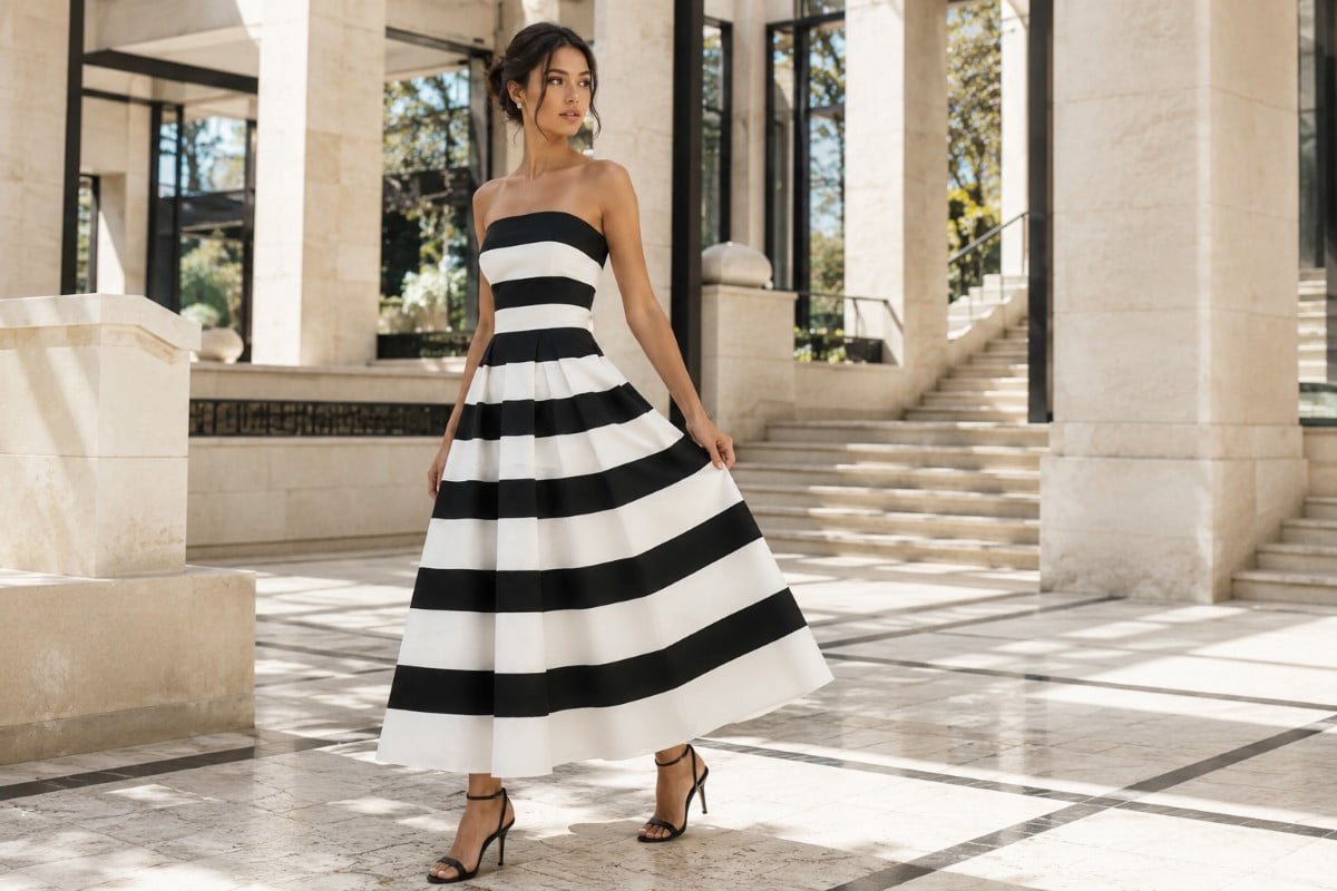
A horizontal break divides the body
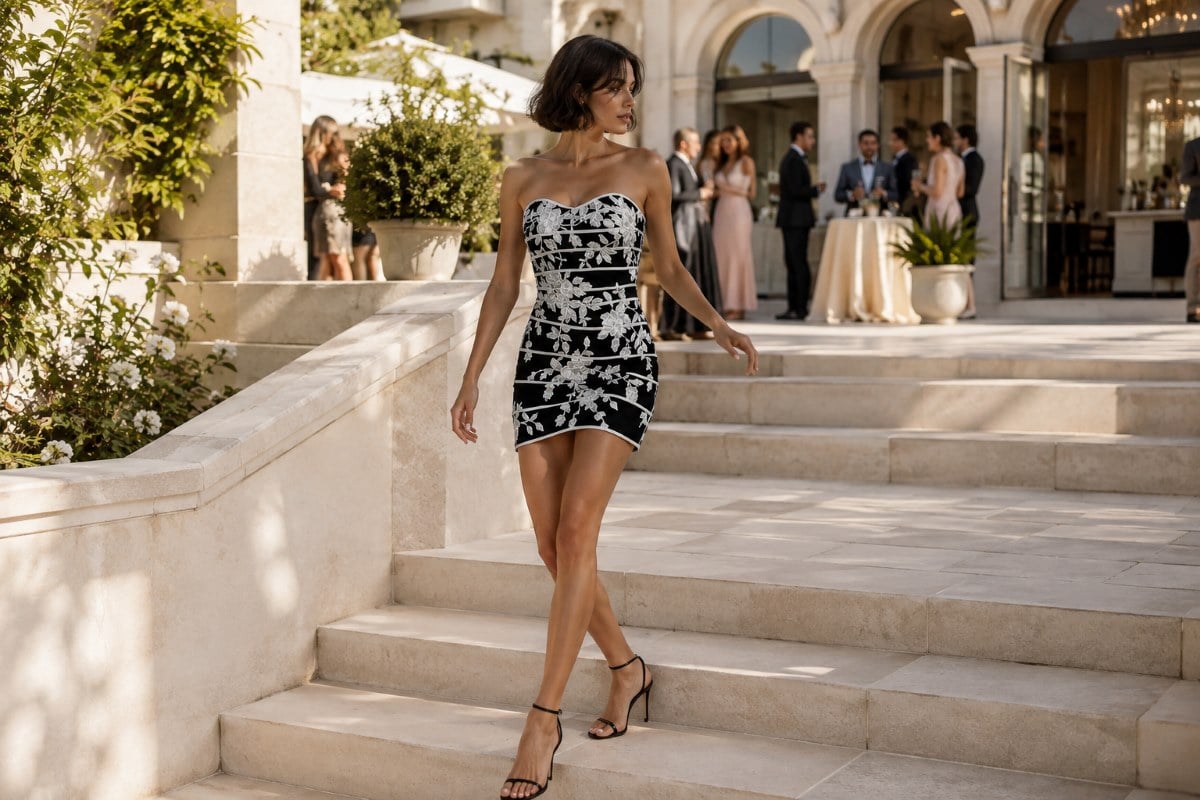
When black and white meet in a horizontal line, the dress visually cuts you at that point and the eye reads two separate blocks rather than one continuous line. This is enormously useful when you want it and unhelpful when you do not. A break at the natural waist emphasizes the waist and reads as flattering on almost everyone, which is why a black bodice with a white skirt is such an enduring formula. A break at the hip or the widest part of the thigh draws attention exactly there, which is rarely the intention. The rule is simple: the horizontal line should land where you want the eye to stop, and on most people that means the waist rather than anywhere lower.
A vertical or diagonal break lengthens
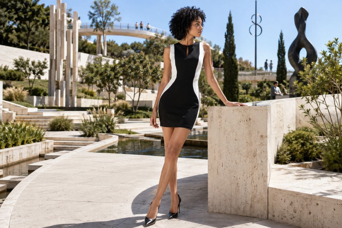
When the contrast runs vertically, the effect reverses. A white panel down the center with black at the sides, or a black panel with white at the sides, creates a long unbroken line that the eye follows from top to bottom, which reads as elongating and slimming. A diagonal contrast, such as a black bodice cutting across to a white skirt at an angle, does something similar while adding movement. This is why color-blocked evening dresses so often use vertical panels: the technique is doing real work rather than just looking modern.
The main ways black and white are combined
Understanding the common approaches makes it easier to know what you are actually looking at.
Color blocking uses solid areas of each shade, which produces the boldest and most graphic result and puts all the emphasis on where the break falls. This is the version where proportion matters most.
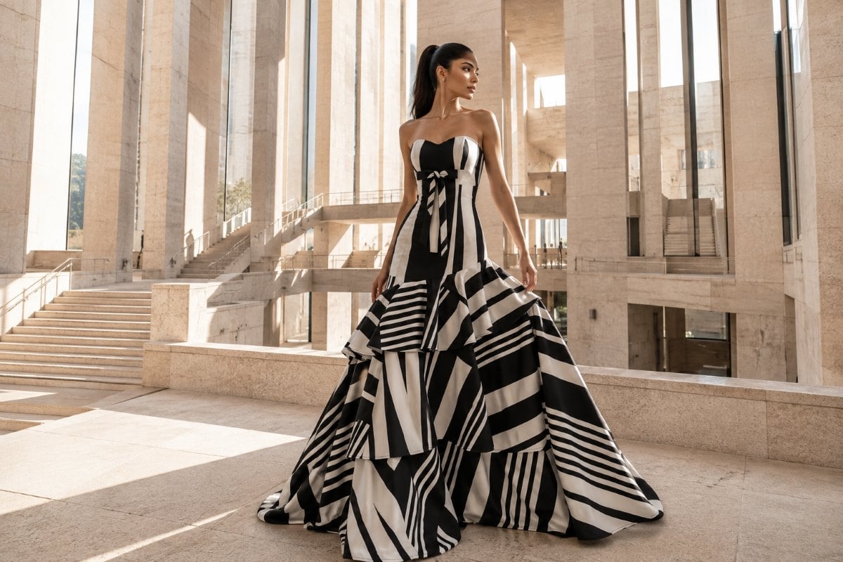
A print combines the two across the whole dress, in florals, stripes, polka dots, or abstract patterns. Here the contrast is distributed rather than concentrated, so it reads as busier but does not create a single dividing line. Scale matters a great deal with prints: a large-scale black and white print reads as bold and modern, while a fine one reads almost as a mid-gray texture from a distance.
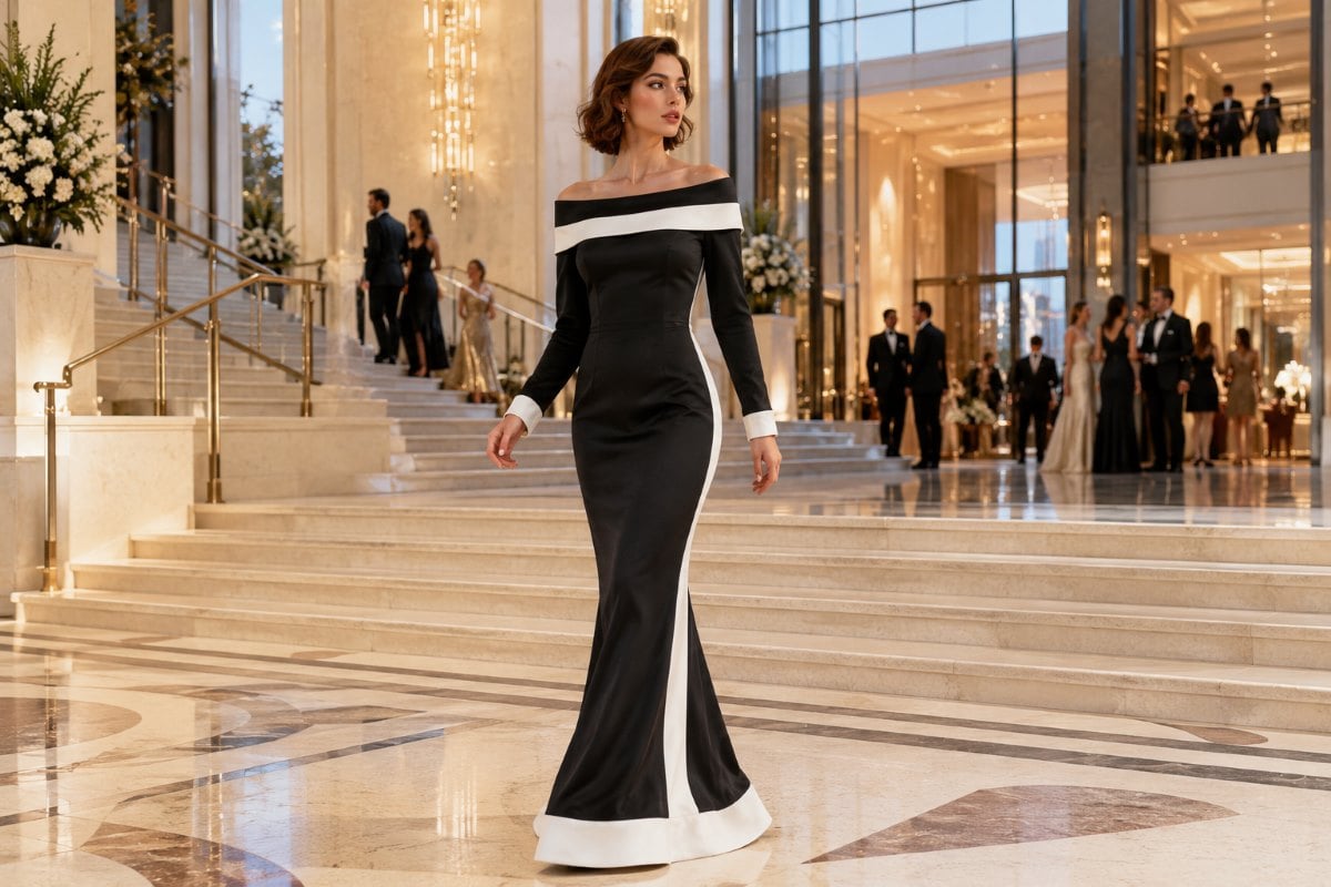
A trimmed or accented approach uses one shade as the dress and the other as a detail, such as a white gown with black piping, a black dress with a white collar, or a contrast sash. This is the most restrained version and the easiest to wear, since the contrast is small enough to be a detail rather than a structural statement.
Finally, a sheer or lace layer of one shade over the other creates a softer, more tonal contrast, where black lace over white produces grays and depth rather than a hard edge. The range of black evening dresses shows how the darker half behaves on its own, which is a useful reference point.
Which shade should dominate
The balance between the two changes the entire character of the dress, and it is worth deciding deliberately rather than by accident.
A predominantly black dress with white detail reads as formal, slimming, and slightly conservative. It suits an evening event and behaves much like a black dress with an added point of interest.
A predominantly white dress with black detail reads as fresher, lighter, and more modern. It photographs brighter and suits a daytime or spring event particularly well, though it demands more care with fit since white shows every line.
An even split is the boldest option and the one that most clearly reads as a black and white dress rather than as a dress in one color with trim. It is also the version where the placement of the break matters most, since neither shade is subordinate. The styles among white evening dresses show the lighter half in isolation, which helps in judging how much white you want.
Print scale changes the whole effect
With a black and white print, the size of the pattern matters as much as the pattern itself. A large-scale print reads as bold, modern, and graphic, and it holds its character across a room and in photographs. A very fine print does something quite different: at conversational distance the two shades blend optically and the dress reads almost as a mid-gray texture rather than as black and white at all. Neither is wrong, but they produce opposite results, so it is worth stepping back from the mirror rather than judging a print at arm’s length.
Fabric decides whether the contrast is hard or soft
The same two shades can meet sharply or gently depending on what they are made of. A crisp fabric such as taffeta or mikado produces a hard, defined edge where black meets white, which reinforces the graphic quality. A soft fabric such as chiffon lets the shades meet with more give, and a sheer black layer over white creates grays in between rather than a clean line. Lace does something similar, producing depth and tonal variation instead of a boundary. If the full contrast feels too severe, changing the fabric softens it without changing the concept.
Where a black and white dress works
The combination suits a wider range of occasions than almost any single color. It reads as appropriate at a cocktail party, a formal evening event, a gala, a graduation, a work function, and a school dance. It suits daytime and evening equally, since the balance between the shades can shift to match.
There is one occasion that needs thought, and that is a wedding where you are a guest. A predominantly white dress with black detail can read as too close to bridal in photographs, particularly in a group shot. A predominantly black dress with white accents avoids the problem entirely, as does a black and white print where neither shade dominates. If in doubt at a wedding, let black carry the majority.
The other consideration is a very traditional or somber setting, where a heavily black dress can read as funereal to an older or more conservative crowd. Adding white in a meaningful proportion resolves that, which is part of why the combination has always been the acceptable way to wear black to a celebration. The piece on why a black dress works for any formal event covers the reasoning behind that.

How black and white differs from a monochrome look
These two ideas get confused and they are close to opposites. A monochrome look uses a single color throughout, including its lighter and darker versions, to create one continuous tonal field with no interruption. The effect is smooth, elongating, and quiet.
A black and white dress does the reverse. It uses maximum contrast to create deliberate interruption, and the interest comes precisely from the break rather than from the absence of one. One technique hides the seams between areas and the other announces them.
Knowing which effect you want makes the choice straightforward. If you want the longest, calmest line, monochrome is the technique. If you want a graphic, structured look with a defined shape, black and white is. The treatment of the monochromatic evening gown covers the alternative approach in detail.
Styling a black and white dress
Because the dress is already high contrast, the styling that works is generally restrained.
For metals, silver and white gold sit most naturally with the crispness of the combination, while gold introduces a warm third element that can either look rich or look like an afterthought depending on how much of it there is. A single gold piece works; gold everywhere competes.
For shoes, black is the safest and most cohesive, particularly with a predominantly black dress. A nude matched to your own skin depth lengthens the leg and keeps the focus on the dress. Metallic silver works with either balance. What generally does not work is a colored shoe, since introducing a third color undermines the graphic quality that made the combination worth choosing.
The one place a color can genuinely earn its place is a single strong accent, most often a red lip or a red bag. Black and white is such a neutral ground that one saturated accent reads as deliberate and striking rather than as a clash. The discipline is to choose one accent rather than several. For the closely related question of the two shades on their own, the comparison of the little white dress and the little black dress is a useful companion.
The check almost everyone skips
One check matters more than everything else combined, and it cannot be done on a hanger. Look at where the contrast line falls on your own body rather than on the hanger, since a break that sits at the waist on a taller frame may sit at the hip on a shorter one, and the same dress will do opposite things to two people. This is the single most important check and the one most often skipped.
Decide which shade you want to dominate, since that sets the formality and the mood before any other decision. And check the quality of the white specifically, because white and off-white read very differently side by side with black, and a slightly yellowed white against a true black looks like a mistake rather than a choice. The two shades in the dress should look deliberately paired.
Handled with attention to where the contrast sits, a black and white dress is one of the most reliably sophisticated things in formalwear, and one of the very few that suits every complexion without adjustment. The styles built around the little black dress show the darker half at its simplest and most versatile.
Seeing the other half in isolation is just as useful when you are deciding which shade should dominate. The styles built around the little white dress show what white does on its own before any contrast is added. To see how contrast, print, and trim are used across formal silhouettes, explore the current styles through an authorized Jovani retailer.
Black and White, Answered
Why is black and white considered such a classic combination?
Because it works on value rather than color. Black sits at one end of the tonal scale and white at the other, producing the strongest contrast available in clothing, and the eye reads high contrast as deliberate. It also removes the question of color harmony entirely, since there is no undertone to match and no risk of clashing with your complexion. That is why it suits every skin tone without adjustment and why it has survived every shift in fashion.
Where should the black and white meet on a dress?
Wherever you want the eye to stop, because high contrast draws attention to the break. A horizontal line at the natural waist emphasizes the waist and flatters almost everyone. A horizontal break at the hip or widest part of the thigh draws attention exactly there, which is rarely the intention. A vertical or diagonal contrast has the opposite effect, creating a long unbroken line that reads as elongating.
Can you wear a black and white dress to a wedding?
Yes, with one caution. A predominantly white dress with black detail can read as too close to bridal in photographs, especially in a group shot beside the bride. A predominantly black dress with white accents avoids the issue entirely, as does a print where neither shade dominates. If in doubt, let black carry the majority. Black and white is also the traditional way to wear black to a celebration without it reading as somber.
What is the difference between black and white and monochrome?
They are close to opposites. A monochrome look uses one color throughout, including its lighter and darker versions, to create a continuous tonal field with no interruption, which reads as smooth and elongating. A black and white dress uses maximum contrast to create deliberate interruption, and the interest comes from the break itself. One technique hides the transitions and the other announces them, so the choice depends on which effect you want.
What shoes and jewelry go with a black and white dress?
Restraint works best, since the dress is already high contrast. Silver and white gold sit most naturally with the crispness of the combination, while a single gold piece can work as a warm accent. For shoes, black is safest and most cohesive, a nude matched to your skin depth lengthens the leg, and metallic silver suits either balance. A colored shoe usually undermines the graphic quality that made the combination appealing.
Does black and white suit every skin tone?
It is one of the few combinations that really does, because it works on contrast rather than on color, so there is no undertone to match or clash with. The adjustment worth making is in the balance rather than the shades. Very fair complexions sometimes look best with black carrying more weight, since a large area of white can sit close to the skin’s own value, while deeper complexions carry either balance beautifully and look particularly striking in predominantly white designs.