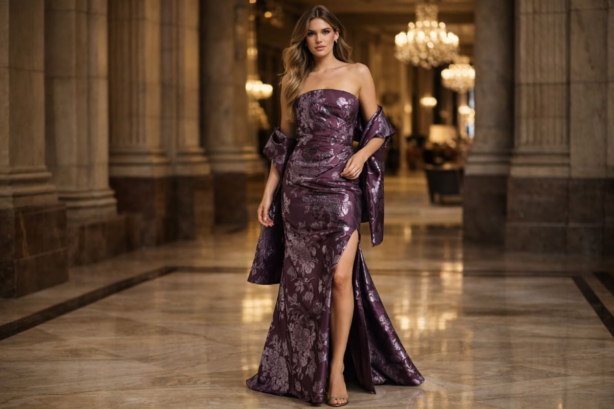


Burgundy is what happens when red grows up. It carries the same warmth and confidence, but the depth pulls it back from anything demanding, so a burgundy dress reads as rich and considered where a bright red would read as a declaration. That single quality explains why burgundy appears so consistently across formalwear, from evening gowns to mother of the bride dresses to wedding guest attire, and why it is one of the very few colors that works equally well at a black-tie gala and a family celebration. It is also more complicated than it looks, because burgundy, wine, maroon, and oxblood are not the same shade and they do not suit the same people. This guide covers what separates them, who each one flatters, how burgundy behaves under evening lighting, which fabrics change it most, and where it works as a guest.
What burgundy actually is
Burgundy is a deep red with a purple undertone, named after the wine region and describing roughly the color of the wine itself. That purple content is the whole distinction, because it is what separates burgundy from a simple dark red and gives it the cool, slightly muted quality that reads as sophisticated rather than bright.
The family around it is worth learning, since the names get used interchangeably while the shades themselves differ. Wine is close to burgundy and often used as a synonym, generally sitting slightly deeper. Maroon is browner and warmer, with less purple and more earth in it. Oxblood is darker still and leans toward brown-black. Merlot and claret sit around burgundy with small variations. Cranberry and berry are brighter and pinker, closer to a true red.
The practical consequence is that a dress described as burgundy might be any of these, so judging the shade in person rather than by the label is the only reliable approach. The red styles among red evening dresses show the wider family that burgundy sits at the deep end of.
Why burgundy flatters so widely
Burgundy is one of the most broadly flattering colors in formalwear, and the explanation is more precise than it first appears.
The purple content softens the contrast
A pure bright red creates a hard contrast against most complexions, which is why some people find red overwhelming on themselves even when they like the color. Burgundy’s purple undertone cools it and lowers its intensity, which reduces that contrast and lets the color sit against skin rather than shouting over it. The result is a shade that brings warmth to the face without the drama, which suits a much wider range of people than red does.
Depth flatters across complexions
Because burgundy is deep rather than bright, it works on the same principle that makes navy and forest green so reliable: a dark saturated color provides contrast against fair skin, harmony against medium and olive skin, and richness against deep skin. Cool undertones suit the truest burgundy and wine, where the purple is most present. Warm undertones often look better in maroon or a warmer merlot, where there is more brown in the mix. Neutral undertones can wear almost the entire family. The guide to the best dress colors for your skin tone covers how to identify your undertone.
Neckline controls how much color reaches your face
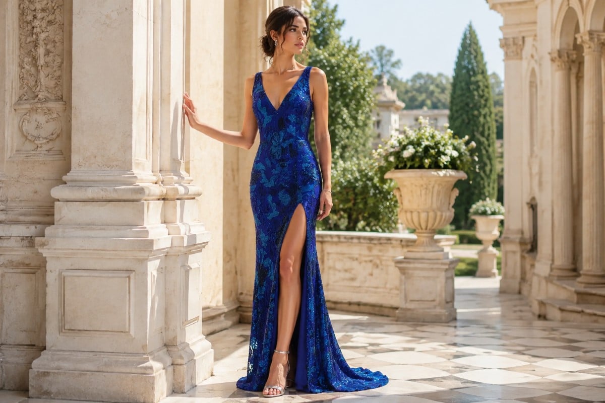
With a deep shade, the neckline decides how much of the color sits directly against the skin of the neck and jaw, and that changes the effect more than most people anticipate. A higher neckline brings the burgundy right up to the face, which intensifies both the warming effect and any mismatch in undertone. A lower or wider neckline leaves a buffer of bare skin, which softens the relationship and makes a shade that is almost right considerably more forgiving. If a particular burgundy appeals but feels slightly heavy, changing the neckline often works better than changing the shade.
Burgundy takes embellishment in either direction
One practical advantage of the shade is that it accepts detail without becoming confused. Gold beading over burgundy warms it and pushes the whole dress toward richness, which is the most traditional pairing. Crystal or silver beading cools and brightens it, adding crispness against the depth. Black beading deepens it further into something quite dramatic. Tonal beading in the same shade adds texture and catches light without altering the color at all. That flexibility means a burgundy dress can be steered toward whichever mood you want.
Burgundy under evening lighting
Deep colors behave differently from bright ones under low light, and burgundy has one particular quirk worth anticipating.
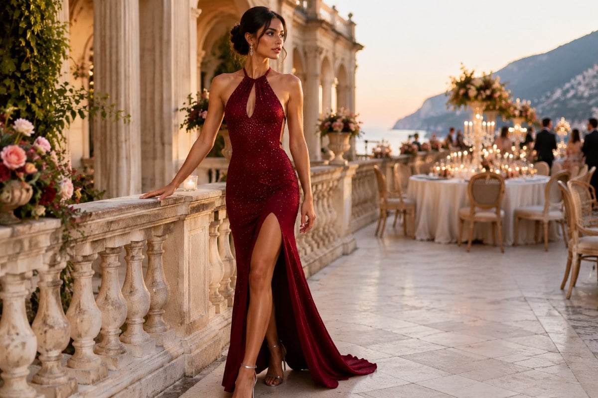
Under warm evening lighting, burgundy deepens and warms attractively, which is why it looks so good at candlelit dinners and receptions. It holds its identity rather than shifting toward another color, which is a genuine advantage over shades like purple and teal that can drift.
The quirk is that in really low light, a very dark burgundy can read as black. This is not a problem in itself, and many people like the effect, but it helps to know if the reason you chose burgundy was to avoid wearing black. If you want the color to remain visible as a color, a slightly lighter burgundy or a fabric with sheen will keep it reading as burgundy rather than as a dark shape.
In daylight the opposite applies, and burgundy shows its purple content most clearly, which is when the difference between burgundy and maroon becomes obvious. The treatment of evening dress color trends covers how the deeper shades sit among the current options.

How fabric changes burgundy
Few colors respond to fabric as dramatically as burgundy does, largely because the shade depends so much on how light interacts with it.
Velvet is burgundy’s natural partner. The pile absorbs light and creates enormous depth, which pushes the color toward its richest, most historic reading. A burgundy velvet gown is about as luxurious as a single color can look, and this pairing appears in formalwear so consistently for good reason.
Satin does the opposite, reflecting light in broad sheets and making burgundy read as glossy and saturated rather than deep. This is the version that photographs most vividly and the one to choose if you want the color to be clearly visible under low light.
Crepe mutes burgundy into something matte and modern, which reads as tailored and understated. Chiffon lightens it considerably, so a strong burgundy in layers of chiffon becomes soft and romantic. Lace over a burgundy lining creates tonal depth and pattern at once. Beading in gold warms the color, while crystal or silver beading cools and brightens it. The styles among velvet dresses show the fabric that suits burgundy best.
Burgundy as a wedding guest color
Burgundy is one of the safest and most popular wedding guest colors available, and there are good reasons for that beyond how it looks.
It is clearly not bridal, it avoids the somber association that black sometimes carries at a wedding, and it is celebratory without competing for attention the way a bright red can. A guest in burgundy reads as well dressed rather than as making a statement, which is exactly the register a guest wants.
There are two things worth checking. Burgundy has become a common bridesmaid color, particularly for autumn and winter weddings, so it helps to know the wedding party palette before committing. And at a very formal wedding, a deep burgundy in a rich fabric reads as appropriately dressed while a lighter or brighter version can read as slightly less formal.
The wider question of red at a wedding is covered in the discussion of whether you can wear red to a wedding, and burgundy sits comfortably on the safe side of it precisely because the depth removes the boldness.
Seeing the family together makes that easier to judge, since the difference between a bright red and a deep burgundy is obvious side by side. The styles among red wedding guest dresses show the range at the deeper end.

Where else burgundy works
The shade is unusually versatile across roles and occasions, which is part of why it appears so often.
For the mother of the bride or groom, burgundy is a strong choice. It reads as formal without being severe, it photographs beautifully in family portraits, and it coordinates with most wedding palettes without matching them exactly. The range of mother of the groom dresses shows how deep colors read at that level of formality.
For prom, burgundy offers something different from the black and red that dominate the room, and it reads as more grown-up than most alternatives without becoming mature. The styles among red prom dresses include the deeper shades at that end of the family.
For a formal evening event or a black-tie gala, burgundy is one of the few colors that competes with black on its own terms, offering the same depth and formality with warmth and personality that black does not have. It also suits an office holiday party, an anniversary dinner, and a milestone celebration, which makes it one of the better investments if you want a formal dress that will be worn more than once.
There is also a small practical advantage to burgundy that nobody puts in a style guide but everyone appreciates on the night. Red wine, cranberry juice, and most of the drinks served at a formal event are close enough in tone to a burgundy dress that a spill is far less visible than it would be on champagne, blush, or pale blue. This is not a reason to choose the color on its own, but at a long reception with drinks in hand it is a genuine reduction in anxiety, and it is part of why burgundy has such a following among people who have had one bad experience in a pale dress.
Styling a burgundy dress
Burgundy is a rich color, so the styling that works tends to support it rather than compete.
Gold is the classic partner, since warm metal against a deep red-purple creates a combination that reads as luxurious. Rose gold works beautifully too and picks up the pink content in the shade. Silver is the harder choice and works best with the coolest, most purple burgundies, where it provides crispness rather than clashing.
For shoes, metallic gold, a nude matched to your own skin depth, and a shoe matched to the dress are the three reliable options. Black works with the deepest burgundies but can read as heavy against a lighter one, and it also removes the warmth that made the color appealing.
For a second color, burgundy pairs unexpectedly well with blush, navy, forest green, and camel, so an accent in one of those reads as considered. What to avoid is a bright red accessory, since the two reds compete and neither wins. Keep jewelry to one focal point, and if the dress is velvet or beaded, keep it minimal, since the fabric is already carrying the interest.
Telling the shades apart in the shop
The whole decision turns on one question you can answer by carrying the dress to a window. Look at the shade in daylight to see how much purple it actually contains, since that is what separates a true burgundy from a maroon and it determines which undertones it will suit. A shade that looks brown in daylight is a maroon and will behave as a warm color; one that looks distinctly wine-toned is a burgundy and will behave as a cool one.
Then decide how visible you want the color to be under low light, and let that guide the fabric. Satin and sequins keep burgundy reading as a color, while velvet and matte crepe let it deepen toward black in a dim room. Neither is wrong, but they produce very different results at an evening event.
Finally, hold it against your face rather than judging it on the hanger, since burgundy’s flattering effect happens at the neckline and the relationship between the shade and your complexion is what you are actually assessing. Handled that way, burgundy is one of the most reliable colors in formalwear and one of the few that earns the description of being both rich and easy to wear. To find the burgundy that reads correctly against your own coloring, explore the current styles through an authorized Jovani retailer.
Burgundy, Wine, and Everything Between
What color is burgundy exactly?
Burgundy is a deep red with a purple undertone, named after the wine region and approximating the color of the wine. That purple content is what separates it from a plain dark red and gives it the cool, slightly muted quality that reads as sophisticated. It sits alongside wine, which is usually a touch deeper, and is distinct from maroon, which is browner and warmer, and oxblood, which is darker still and leans toward brown-black.
What is the difference between burgundy and maroon?
Undertone. Burgundy leans purple, which makes it a cool-toned deep red, while maroon leans brown, which makes it a warm-toned one. In daylight the difference is obvious: a maroon looks earthy and a burgundy looks wine-toned. The practical consequence is that they suit different colorings. Cool undertones generally look better in true burgundy, while warm undertones often look better in maroon, so the labels are worth checking against the actual shade.
Does burgundy suit all skin tones?
It suits an unusually wide range, because it is deep rather than bright. A dark saturated color provides contrast against fair skin, harmony against medium and olive skin, and richness against deep skin. The purple undertone also softens the contrast that a pure red creates, which is why people who find red overwhelming often find burgundy comfortable. Cool undertones suit the truest burgundy, while warm undertones often prefer a maroon or merlot.
Can you wear burgundy to a wedding as a guest?
Yes, and it is one of the safest guest colors available. It is clearly not bridal, avoids the somber association black can carry, and is celebratory without competing for attention the way bright red might. Two things are worth checking: burgundy has become a common bridesmaid color, particularly for autumn and winter weddings, so knowing the party palette helps, and at a very formal wedding a deeper shade in a rich fabric reads as more appropriately dressed.
Does burgundy look black under low lighting?
A very dark burgundy can, and this is worth knowing if you chose the color specifically to avoid wearing black. In low light the shade loses its visible red and reads as a dark shape. If you want the color to remain identifiable, choose a slightly lighter burgundy or a fabric with sheen such as satin or sequins, since reflected light keeps the red visible. Velvet and matte crepe do the opposite and deepen it further.
What jewelry goes with a burgundy dress?
Gold is the classic partner, since warm metal against a deep red-purple reads as really luxurious. Rose gold works beautifully too and picks up the pink content in the shade. Silver is the harder choice and works best with the coolest, most purple burgundies, where it adds crispness. For shoes, metallic gold, a nude matched to your skin depth, or a shade matched to the dress are the reliable options, while black can read as heavy against a lighter burgundy.