
Velvet behaves unlike any other fabric in front of a camera, and that single fact shapes everything about which colors look best in it. Where satin reflects light and sequins throw it back, velvet absorbs light into its raised pile, giving color a depth and richness that flat fabrics simply cannot produce. The result is that certain shades become more intense, more saturated, and more dimensional in velvet than they would be in any other material, while a few colors ask for more care. For anyone choosing a velvet dress with photographs in mind, whether for a holiday party, a winter wedding, or a formal evening, understanding how velvet handles color is the key. This guide explains why velvet photographs the way it does, which shades look richest, how lighting and skin tone factor in, and how to choose a velvet color that looks as beautiful in pictures as it does in person.
Why velvet changes how color photographs
The reason velvet photographs so distinctively comes down to its surface. Velvet has a raised pile that absorbs light rather than reflecting it, which is the opposite of how a smooth, shiny fabric behaves. This light-absorbing quality gives velvet a visual depth and color richness that no other textile can replicate, with shades appearing more intense and saturated than they would in a flat fabric.
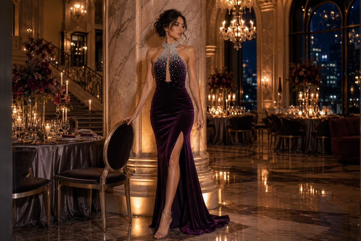
This matters enormously for photographs, because velvet does not create the harsh glares or bright flashbacks that shiny fabrics sometimes produce under flash. Instead, it photographs with a rich, saturated color and a soft, dimensional quality, almost a soft-focus depth that flatters. The pile catches subtle highlights and creates deep shadows as it moves, which adds dimension a flat fabric lacks. The range of velvet gowns shows how the fabric carries color with this characteristic depth, which is the foundation for understanding which shades photograph best.
The shades that photograph richest in velvet
Some colors are made for velvet, becoming deeper and more luxurious in the fabric than they could be anywhere else. Understanding which shades velvet flatters most helps in choosing a dress that photographs beautifully.
Deep jewel tones
Jewel tones are velvet’s natural partners, since the fabric’s depth intensifies their richness dramatically. Deep emerald, sapphire, and amethyst appear infinitely more intense when dyed into velvet, reading as saturated and luxurious in photographs. Burgundy and deep wine tones are particularly striking, combining velvet’s depth with a warm, sophisticated richness. These deep, saturated colors are where velvet performs at its absolute best, photographing with a dimension and intensity that flat fabrics cannot match.
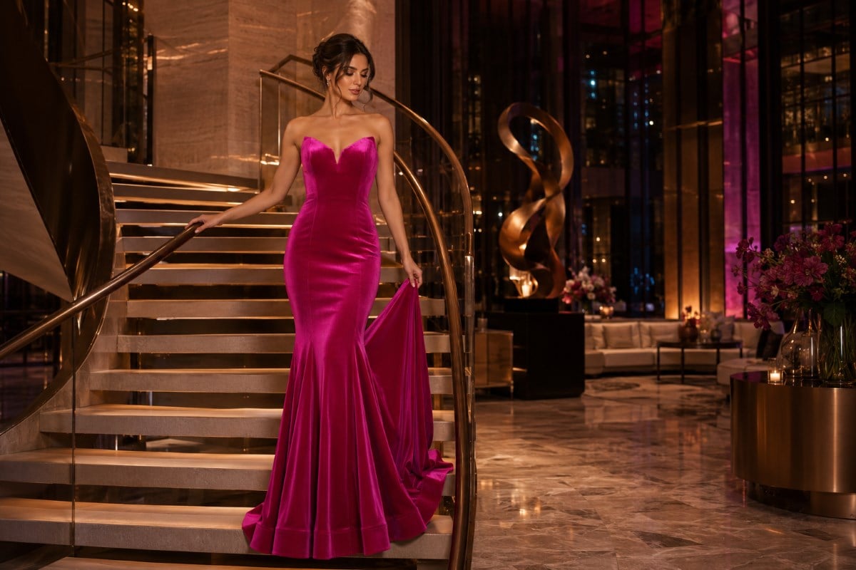
Classic black and midnight blue
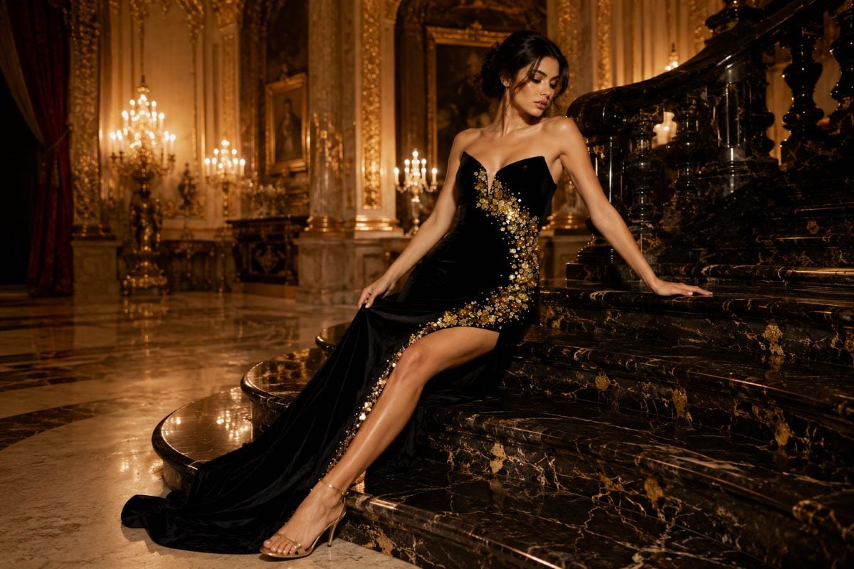
Black and midnight blue take on a special quality in velvet, appearing far richer than they would in a flat fabric. Black velvet reads as deep and luxurious rather than flat, with the pile creating subtle dimension that keeps it from looking like a plain dark shape in photographs. Midnight and navy blue gain a similar depth, reading as rich and sophisticated. These dark shades, often risky in flat fabrics where they can photograph as featureless, become genuinely beautiful in velvet because the pile gives them texture and dimension.
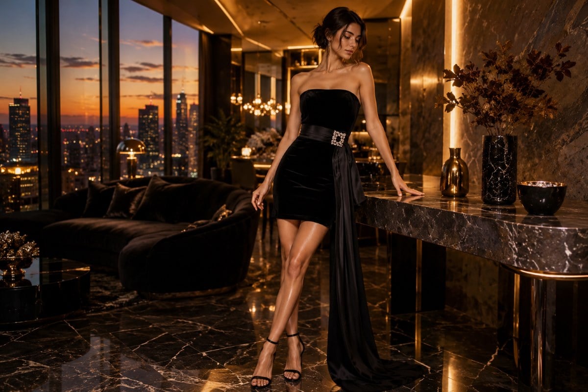
Lighter velvet colors and how they read
While velvet is most associated with deep, rich colors, lighter shades work too and offer a softer, more romantic effect. Blush, champagne, and soft dusty tones in velvet read as gentle and romantic, with the fabric’s depth giving even a pale color a richness that a flat pastel lacks. These lighter velvets photograph softly, reading as warm and elegant rather than washed out.
The key with a lighter velvet is that the fabric’s pile still provides dimension, so a blush velvet looks far richer than a blush satin would, never flat or thin. Dusty rose, soft mauve, and muted sage all take on a velvety depth that flatters. A lighter velvet is a beautiful choice for a softer, more romantic look, and it photographs with a gentle warmth, though for maximum richness and intensity in photographs, the deep jewel tones and dark shades remain velvet’s strongest performers. The styles among evening dresses show how color reads across formal silhouettes, and velvet adds depth to whichever shade it carries.
How lighting changes a velvet color
Velvet’s relationship with light means the lighting at an event affects how its color reads, which is worth planning for. Under warm, low light, the kind found at many evening events and holiday parties, velvet’s color deepens and its dimension becomes most pronounced, which is exactly the setting velvet is made for. The pile catches the soft glow and creates rich shadows, photographing with a beautiful, candlelit depth.
Under bright or natural light, velvet’s color reads more clearly and its texture becomes more visible, with the pile’s direction creating subtle variations in tone. This is generally flattering, though a very bright, direct light can flatten some of velvet’s dimension. Under flash, velvet’s great advantage shows, since it absorbs the light rather than bouncing it back, avoiding the harsh glare a shiny fabric produces. For most photographic situations, velvet is forgiving and flattering, which is part of why it has become such a photogenic choice. For how velvet fits the warm-lit settings it suits best, the guide to dressing for holiday events covers the candlelit occasions where velvet’s depth shines.
Matching velvet color to your skin tone
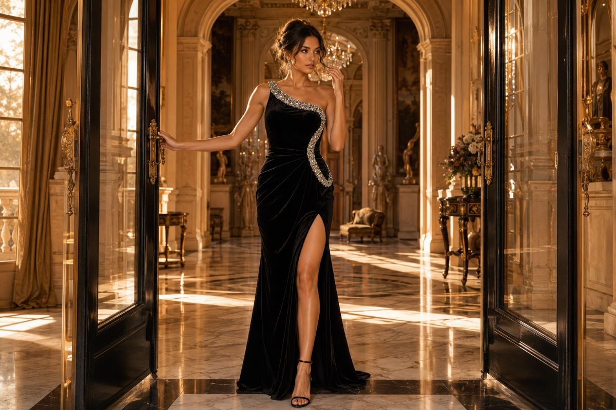
Beyond how a color photographs on its own, how it reads against your skin matters, and velvet’s depth interacts with complexion in flattering ways. The richness velvet gives a color means it creates a strong, intentional contrast against the skin, which is generally flattering when the shade suits your undertone.
Warm skin tones with golden or olive undertones look beautiful in warm velvets like burgundy, deep emerald, and rich amber, where the warmth of the color echoes the skin. Cool skin tones with pink undertones suit cool velvets like sapphire, amethyst, and true emerald, which balance the complexion. Deeper skin tones look striking in saturated jewel-tone velvets and rich black, where the depth of the fabric creates a vivid, photogenic effect. The simplest approach is to hold the velvet near your face in the light you expect at the event and see whether the color brightens your complexion. For a fuller framework on choosing a color that flatters your complexion, the guide to choosing a color for your skin tone applies directly to velvet’s rich palette.
Velvet color and the occasion
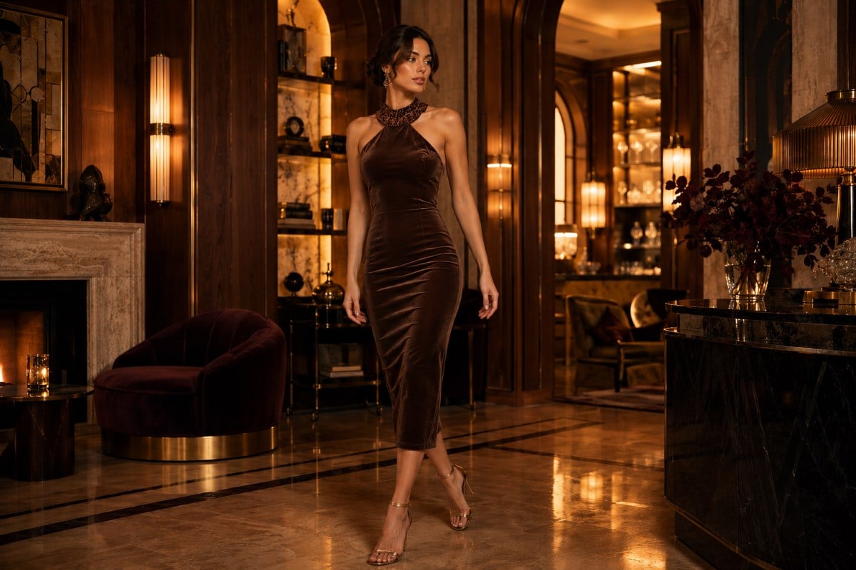
The right velvet color also depends on where you are wearing it, since different occasions suit different shades. For a holiday party, classic festive colors in velvet read as seasonal and rich, with deep red, emerald, and burgundy feeling unmistakably celebratory. For a formal evening or black-tie event, deep jewel tones and black velvet read as sophisticated and appropriately formal.
For a winter wedding as a guest, a velvet in a rich jewel tone or a deep neutral reads as elegant and seasonal, provided the shade clearly avoids bridal colors. For a cocktail party, velvet in a sophisticated color, whether a jewel tone, black, or an unexpected modern shade, reads as chic and current. Matching the velvet color to the occasion keeps the look appropriate while letting the fabric’s depth do its work. The range of cocktail dresses shows how velvet’s colors read in a semi-formal length.
For a timeless, versatile option, black velvet is hard to beat, and the styles built around the little black dress show how black velvet anchors a photogenic look that works across nearly every occasion.
Keeping velvet color looking its best in photos
A few practical considerations help velvet photograph at its richest. Because velvet’s pile shows direction, brushing the pile so it lies consistently keeps the color reading evenly in photographs, since crushed or uneven pile can create patchy tone. Steaming rather than pressing keeps the pile lifted and the color deep, while a heavy press can flatten the pile and dull the richness that makes velvet photograph so well.
It also helps to know that velvet’s color reads deepest when the fabric is clean and well cared for, since dust or wear can mute the pile’s depth. Storing a velvet dress hung rather than folded prevents crush marks that would show as lighter patches in photographs. These small steps protect exactly the quality that makes velvet so photogenic, its rich, even, dimensional color. With the pile lying smoothly and the color deep, a velvet dress photographs with the saturated, candlelit richness the fabric is known for. For more on keeping velvet reading as sophisticated rather than costume, the guide to styling a velvet cocktail dress covers the cuts and styling that keep velvet contemporary.
Choosing a velvet dress color with confidence
When choosing a velvet dress color, a few checks help ensure it photographs beautifully. First, consider the lighting you expect at the event, since velvet’s depth shows most beautifully under the warm, low light of evening occasions, while bright light reveals more texture. Second, match the color to your undertone, choosing a warm velvet for warm skin and a cool velvet for cool skin so the shade flatters your complexion.
Third, match the color to the occasion, leaning toward festive shades for a holiday party and sophisticated jewel tones or black for a formal event. For maximum richness and intensity in photographs, deep jewel tones, burgundy, black, and midnight blue are velvet’s strongest performers, while lighter velvets offer a softer, romantic alternative. A velvet dress in a well-chosen color photographs with a depth and saturation no other fabric can match, which is the whole reason to choose velvet in the first place. For how velvet compares to other fabrics in formalwear, the guide to popular evening dress fabrics covers velvet’s photogenic qualities in context. To see how deep jewel tones and rich darks read across velvet silhouettes for your next event, explore the current styles through an authorized Jovani retailer.
Velvet colors through the seasons
Velvet is most associated with the colder months, and the season shapes which colors feel right, even though the fabric itself can be worn whenever the air is cool enough. Aligning a velvet color with the season keeps the look feeling intentional and current, since color carries strong seasonal associations that affect how a velvet dress reads.
Fall and winter velvet shades
The cold-weather months are velvet’s natural home, and the richest, deepest colors feel most at home here. Deep burgundy, forest emerald, plum, and midnight blue read as luxurious and seasonal in velvet, photographing with the depth the fabric is known for under warm winter lighting. Classic black velvet anchors the season beautifully, while jewel tones across the board feel festive and rich. These deep, saturated velvets suit the holidays, winter weddings, and cold-weather galas, where the fabric’s warmth is practical as well as beautiful, and where its color reads at its most intense.
Spring and warm-weather velvet
Velvet is less expected in warmer months, but lighter velvet colors can work for a cool spring evening or an air-conditioned event. Softer shades like dusty rose, soft mauve, muted sage, and champagne read as gentler and more romantic, suiting the lighter mood of spring while still offering velvet’s characteristic depth. A lighter velvet in a softer color reads as fresh rather than heavy, which keeps it from feeling out of season. The key in warmer months is choosing a lighter color and being mindful of the setting, since velvet’s warmth suits a cool evening better than a hot afternoon, and a softer shade keeps the look seasonally appropriate.
In the end, the reason to choose velvet over a flat fabric comes down to color, since no other material gives a shade the same depth, saturation, and dimension in person and in photographs. Choosing the right velvet color, matched to your skin tone, the lighting, the season, and the occasion, lets the fabric deliver exactly the rich, candlelit beauty that makes velvet worth wearing.
velvet dress colors FAQs
What color velvet dress photographs best?
Deep jewel tones photograph best in velvet, since the fabric’s light-absorbing depth intensifies their richness dramatically. Emerald, sapphire, amethyst, and especially burgundy read as saturated and luxurious in photographs. Black and midnight blue also take on a special depth in velvet, appearing rich and dimensional rather than flat. These deep, saturated shades are where velvet performs at its absolute best, photographing with an intensity and dimension that flat fabrics cannot match.
Why does velvet look so rich in photos?
Velvet has a raised pile that absorbs light rather than reflecting it, which gives color a visual depth and richness no other fabric can replicate. This light-absorbing quality means velvet photographs with rich, saturated color and a soft, dimensional quality, while avoiding the harsh glare or flashback that shiny fabrics produce under flash. The pile catches subtle highlights and creates deep shadows as it moves, adding a dimension that makes colors appear more intense and luxurious than they would in a flat fabric.
Can you wear light-colored velvet?
Yes, lighter velvets like blush, champagne, and dusty tones work beautifully and offer a softer, more romantic effect. The fabric’s pile still provides dimension, so a blush velvet looks far richer than a blush satin would, never flat or thin. Lighter velvets photograph with a gentle warmth and read as elegant rather than washed out. For maximum richness and intensity in photographs, deep jewel tones and dark shades remain velvet’s strongest performers, but lighter velvets are a lovely romantic choice.
Does black velvet photograph well?
Yes, black velvet photographs beautifully, far better than black in a flat fabric. The pile gives black velvet a rich, dimensional quality, creating subtle texture and depth that keep it from looking like a flat, featureless dark shape in photographs. Black is often risky in shiny fabrics where it can photograph as a dark void, but velvet’s light-absorbing surface gives it depth and richness, which makes black velvet a sophisticated, genuinely photogenic choice for formal occasions.
What velvet color suits my skin tone?
Warm skin tones with golden or olive undertones look beautiful in warm velvets like burgundy, deep emerald, and amber. Cool skin tones with pink undertones suit cool velvets like sapphire, amethyst, and true emerald. Deeper skin tones look striking in saturated jewel-tone velvets and rich black, where the fabric’s depth creates a vivid effect. The simplest test is to hold the velvet near your face in the light you expect at the event and see whether the color brightens your complexion.
How do you keep velvet looking rich in photos?
Brush the pile so it lies consistently, since crushed or uneven pile creates patchy tone in photographs. Steam rather than press, since a heavy press flattens the pile and dulls the richness, while steaming keeps the pile lifted and the color deep. Store the dress hung rather than folded to prevent crush marks that show as lighter patches. Keeping the velvet clean and the pile smooth protects exactly the rich, even, dimensional color that makes the fabric so photogenic.