
Best Couture Dress Colors for 2026: Fabric, Finish, and Detail
The best couture dress colors for 2026 include aquatic blues, vivid pinks, saturated greens, sculptural black, and metallic gold. The deciding factor is not the shade alone. A couture gown can change color through sheer layers, graduated dye effects, reflective beading, and the way its fabric folds. Compare those details before choosing a palette for your event.
Which Couture Dress Colors Stand Out in 2026?
The most useful palette combines ocean-inspired blues and greens, floral pinks, deep neutrals, and controlled metallic shine. Vogue's coverage of spring 2026 couture noted sea-foam green and deep ocean blue. START by WGSN also highlighted color gradients and mint green in fall 2026 couture. These runway observations provide direction, not a rule that every gown must follow.
Ocean Blue and Blue-Green
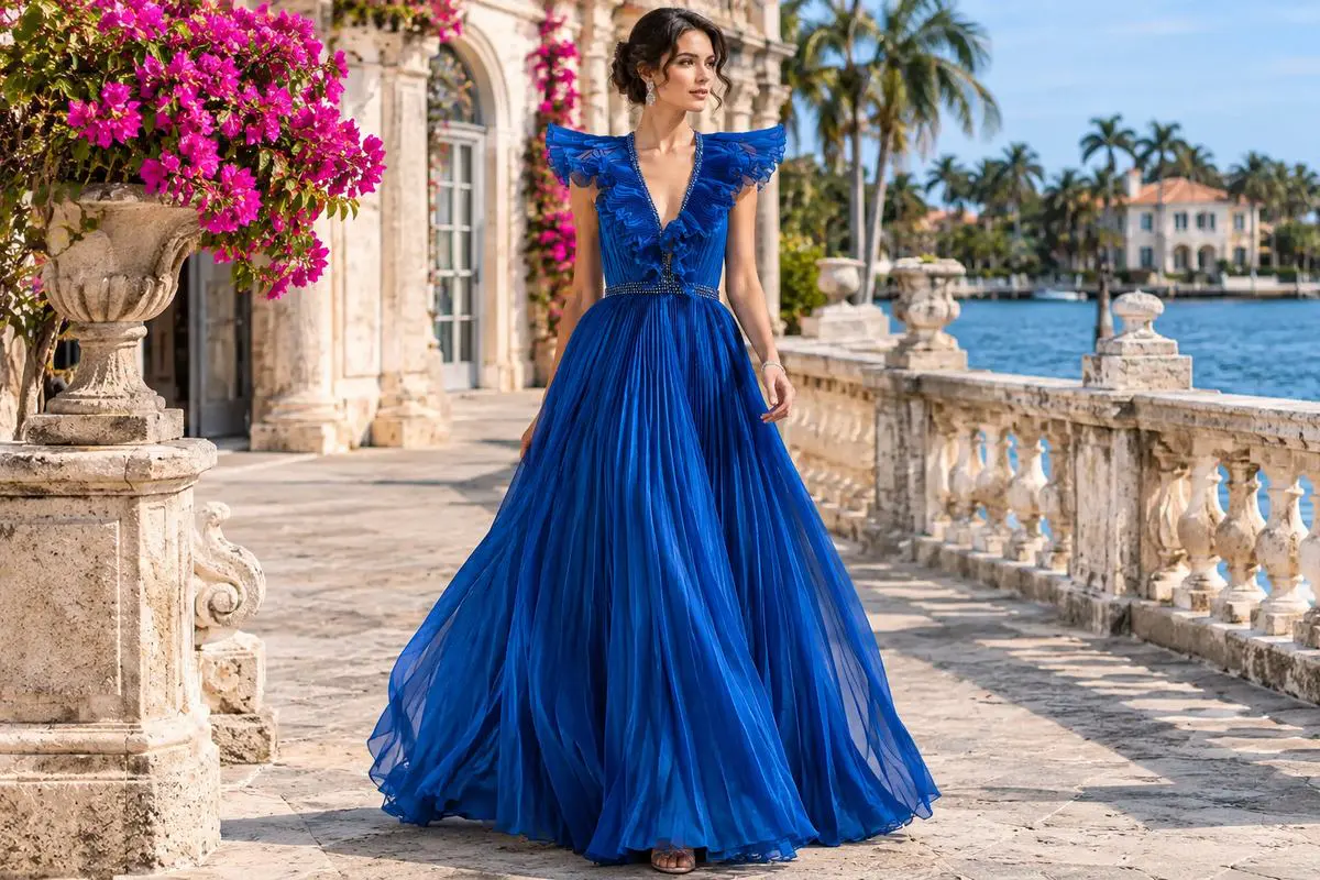
Deep blue gives dimensional embroidery a strong background, while lighter blue can reveal the movement of chiffon or tulle. Teal bridges those effects and works especially well when blue and green elements appear in different layers. The color should remain legible from across a room, not only in close-up photographs.
Jovani's S22362 is offered in blue and blue/teal. Its beaded, pleated chiffon and ruffled neckline show how one cool palette can create several visual textures. Compare blue evening gowns to judge how darker and lighter grounds change the effect of surface detail.
Fuchsia, Blush, and Petal Pink
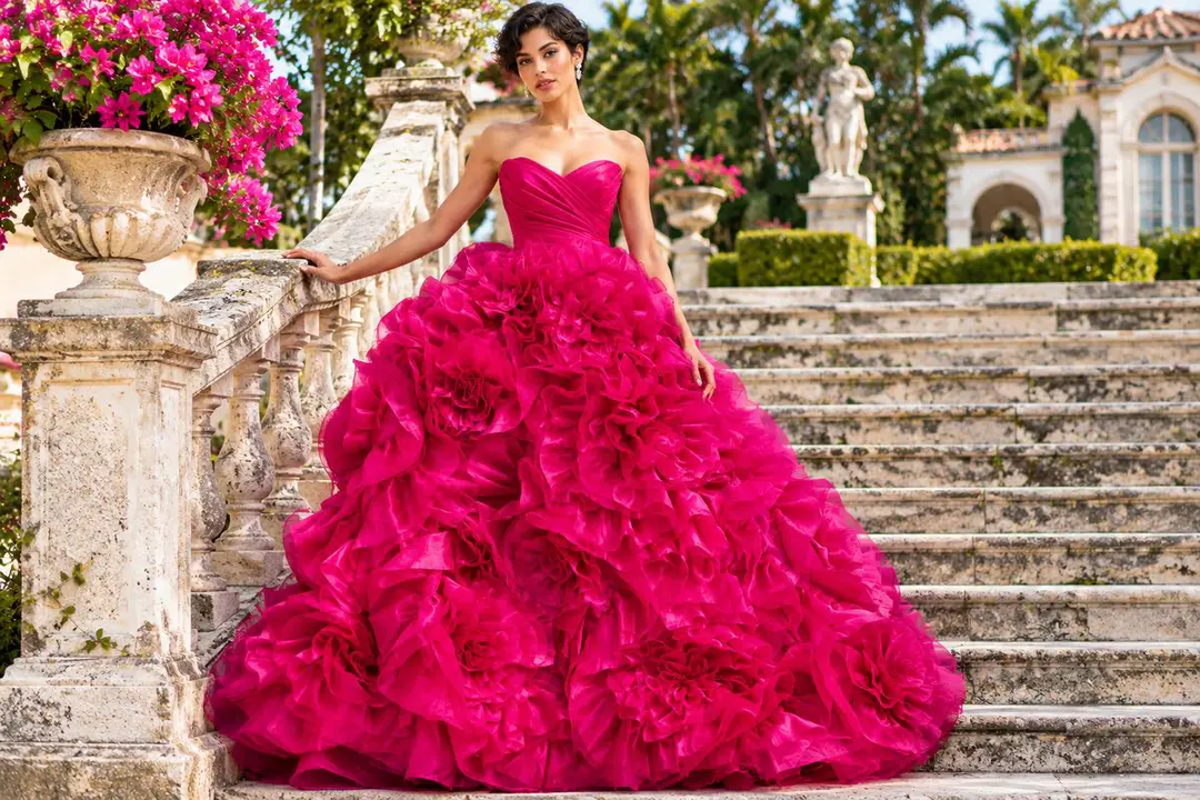
Pink can be soft or architectural, depending on saturation and volume. Blush under translucent organza creates a diffused effect. Fuchsia across large ruffles makes the contour of the skirt easier to see, particularly in photographs taken from a distance.
Jovani style 45495 comes in black and fuchsia, with an organza ball gown skirt built from layered floral ruffles. The color defines each rosette rather than merely covering a flat fabric surface. That makes a saturated pink practical for a gown whose construction deserves attention.
Black and Luminous Gold
Black emphasizes silhouette and can direct attention toward beadwork, sheer sections, or sculpted fabric. Gold does the reverse: it makes reflective texture part of the first impression. Neither option needs additional bold accessories when the garment already carries a strong surface design.
The gold evening gown collection offers a useful visual comparison of metallic fabrics and embroidery. Judge the reflection at both close range and under room lighting, since a heavily decorated gold dress can appear brighter in photographs.
How Does Couture Construction Change a Color?
Couture color is a combination of the base fabric, any transparent overlay, and the decoration sewn onto it. The same color can appear muted on one panel and saturated on another because light passes through different amounts of material.
Sheer Layers and Color Gradients
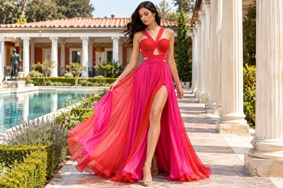
A sheer overlay can soften a vivid base or create the impression of depth without adding another strong hue. An ombre transition moves the eye through the gown and can emphasize a flowing skirt. Look for a smooth progression rather than two unrelated color blocks.
Jovani S40412 lists red/pink and royal/ombre options, with chiffon, a layered skirt, and a gradient color transition. The finished effect comes from the relationship between colors and movement. If you prefer this approach, use couture evening gowns as a starting point for comparing layered fabrics.
Color Placed Through Beading and Print
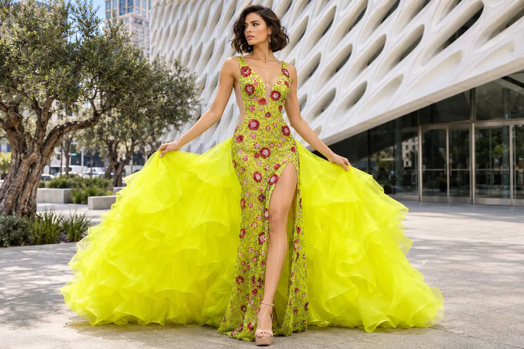
Embellishment can establish a secondary color without changing the fabric beneath it. A blue beaded motif on a pale gown reads differently from an all-blue design. Print brings color across larger areas, while crystals and sequins change with the angle of light.
Jovani style S24070 combines a chartreuse listing with sheer printed fabric and beading. The effect is more complex than a single-color swatch suggests. For context on how construction supports these details, see Jovani's guide to luxury couture gowns for red carpet events.
How Should You Match a Color to the Silhouette?
Choose a palette that supports the silhouette rather than competing with it. A broad organza skirt gives one color a large surface, while a close-fitting sheath places more attention on the bodice, seams, and individual embellishments.
For sculptural volume, inspect where folds cast shadows and whether the color stays consistent across raised fabric. For a fitted dress, watch the placement of contrasting beads around the waist and hips. Browse fitted couture dresses to compare how concentrated details alter a long, close silhouette.
A green or teal design can be effective in either cut, but fabric changes the result. Light chiffon gives movement to the shade; a fitted, embellished surface can hold the eye on individual patterns. Compare green formal gowns for a broader view of different materials in the same color family.
How Can You Check the Color Before Choosing a Gown?
Start with the exact product color name, then study the fabric and detail photographs. Do not assume that an image showing one shade proves that every listed variant has identical decoration. The color of the lining also matters when a dress includes sheer panels.
Jovani 42861, for example, lists fuchsia, light pink, off-white, red, royal, and yellow with a pleated chiffon bodice. Jovani S38445 lists black and gold, using metallic fabric and sequins. Both illustrate why the color field and material description must be read together. Browse the wider Jovani couture collection before narrowing your choice.
Test Color Under the Lighting of Your Event
Look at the gown in daylight and the type of artificial light you expect at the venue. Photograph it from the front and side, both with and without flash. Sheer overlays may show more contrast in direct light, and reflective beading can appear brighter than the underlying fabric.
Do not rely on the phone screen alone. Request a fabric swatch when the retailer can provide one, or inspect the actual garment in person. For general seasonal palettes rather than couture construction, Jovani's separate guide to evening dress color trends covers that broader question.
Avoid These Common Couture Color Mistakes
A color choice can look incomplete when the base fabric, lining, and embellishment pull in conflicting directions. Check all three before deciding that a shade works. A multicolored bodice may also feel more balanced with a quieter skirt than with an equally busy printed train.
Other problems are practical: treating off-white as suitable for a wedding guest or choosing metallics from a studio image alone. A dramatic ruffle also changes the visible area of a bright shade. If the event is a wedding, follow the couple's dress guidance and avoid a bridal-looking palette.
Choose the Palette That Works on You
Hold the actual fabric near your face rather than judging color solely from a promotional image. Compare two nearby shades in similar light. If the gown has a contrasting neckline or embroidered bodice, evaluate that upper section first because it sits nearest your complexion.
For a focused explanation of undertones, Jovani's evening dress color guide for your skin tone covers complexion matching. Then return to your preferred couture design and check its exact color options, movement, and finish. The best couture dress colors work with both the person and the construction.
To compare actual styles, colors, and fabric samples, speak with an authorized Jovani retailer through the Jovani store locator.
Frequently Asked Questions
What color couture dress works for a formal evening gala?
Start with black, deep blue, teal, or metallic gold, then assess the design's volume and decoration. A heavily embellished gown usually needs fewer extra color accents than a simple satin design.
Is ombre appropriate for a couture evening gown?
Yes. Ombre works especially well on layered chiffon and other flowing fabrics because a gradual color change follows the skirt's movement. Check how the transition appears in full-length photographs.
Can a couture gown have more than one color?
Yes. Two-tone fabric, multicolored beading, print, and transparent overlays can all introduce several hues. The strongest combinations repeat or transition colors intentionally instead of scattering unrelated accents.
Should I choose the same shade in every fabric?
No. Satin reflects light, chiffon diffuses it, and metallic or beaded surfaces introduce highlights. Compare the actual dress in several lighting conditions before deciding between versions of the same color.