
Color is usually the last thing people decide and the first thing everyone notices. It sets how your skin reads in photographs, whether you blend into a group shot or stand apart, and how the whole outfit feels before anyone gets close enough to see the detail. This guide covers the shades that dominate prom, the ones almost nobody picks, how color works across a whole group rather than one dress, and how to choose between two you cannot separate.
What are the most popular prom dress colors?
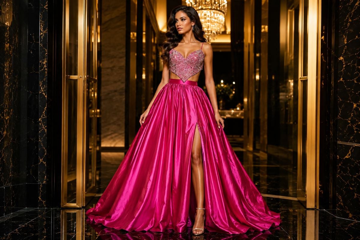
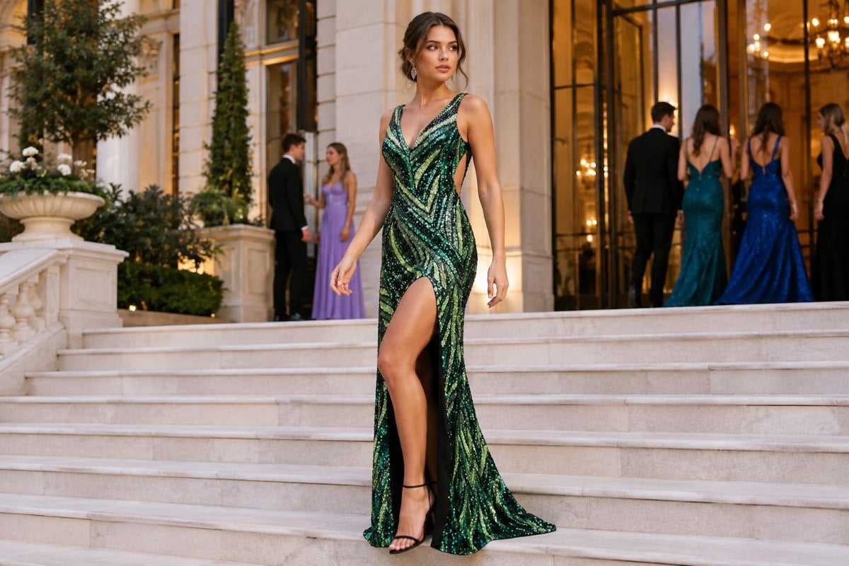
Which prom dress colors come up most often? Black, red, blue and emerald green are the four that appear at every prom, in that rough order. A black gown is the most chosen because it suits every complexion and never looks out of place. Red carries the most presence and photographs strongest. Blue covers the widest range, from pale sky to deep navy, which is why it works for so many people. Emerald has moved from occasional to standard because it holds its depth under evening lighting better than almost any other shade. Beyond those four, pink, burgundy, silver and gold make up most of the rest of the room.
Asking what color prom dress should I wear usually starts here, and popularity cuts both ways. A common shade is common because it works, but it also means several people in your year will wear it. If that matters to you, the answer is not to abandon the color, it is to change the fabric or the silhouette so yours reads differently in the same shade.
Prom colors as a whole scheme, not just a dress
The best prom colors are rarely decided one dress at a time. Most color advice stops at your own gown, which misses how the night actually looks. Prom colors work as a scheme across a group photograph, a date’s outfit, the venue lighting and often a school theme. Getting that right matters more to the final pictures than the precise shade of your dress.
Choosing colors for prom starts with the theme if your school has set one. A stated palette narrows your options usefully rather than restricting you, and it stops the awkward outcome where your gown clashes with the backdrop in every photograph. If there is no theme, the venue lighting becomes the guide, since a warmly lit ballroom flatters jewel tones and metallics while a bright gym is kinder to saturated brights and clean neutrals.
The most useful color ideas for prom apply to a group rather than a person, and the strongest approach is a single family in different depths rather than everyone in the same shade. Four people in navy, sapphire, cornflower and ice blue photograph as a considered group. Four people in identical royal blue photograph as a uniform. Agreeing the family first and letting each person choose their own depth avoids anyone feeling overruled.
Coordinating with a date follows the same logic. A tie or pocket square that picks up one shade from your dress reads better than a full match, because an exact match in a different fabric almost never lands. One shade echoed rather than copied is what makes the pairing work.
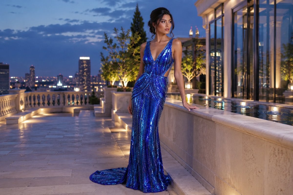
What each color signals
Shades carry associations whether you intend them or not, and knowing what a color reads as helps when you are choosing between two you like equally. Those associations are worth knowing but never worth obeying.
Prom color ideas that stay uncommon
The unique prom dress colors worth chasing are the ones that stay rare, and a few different prom colors come up seldom while still photographing well.
Espresso and chocolate brown have moved into serious contention as a warmer alternative to black, and they pair unusually well with gold jewelry.
Cool prom colors are well covered here too, since deep teal sits between blue and green and reads as more deliberate than either. Rust and burnt orange suit warm complexions and almost never appear in a room. Dusty sage and olive are quiet but hold up in photographs when the fabric has weight. Periwinkle and lilac are the softest of the uncommon options, and they work where a pastel would otherwise wash out.
Among the cute prom colors people ask about most, the one to think twice about is yellow. It reads brilliantly on deep complexions and in bright venues, but it is the least forgiving shade under warm indoor lighting, where it can turn muddy. If you want it, check it under the actual lighting rather than in daylight.
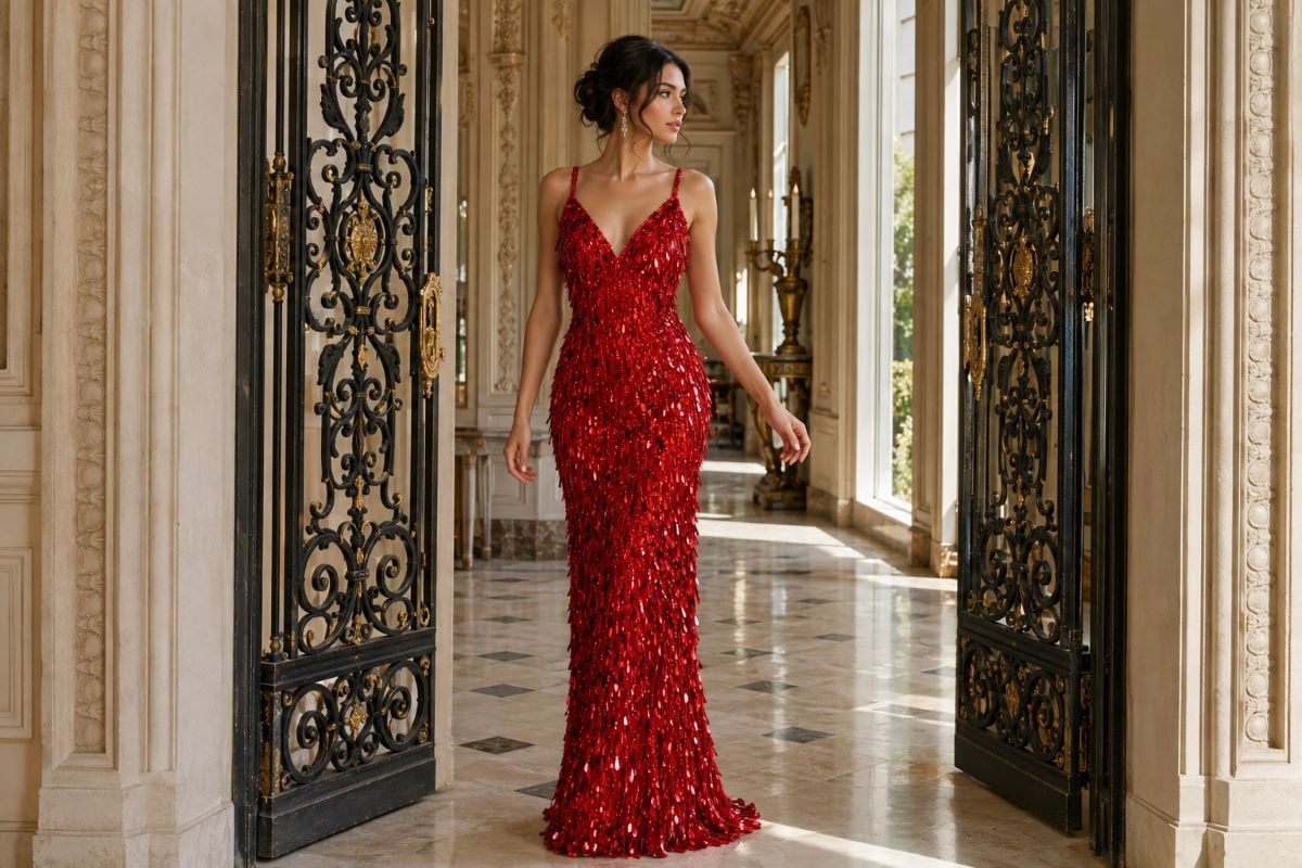
Dresses that change color
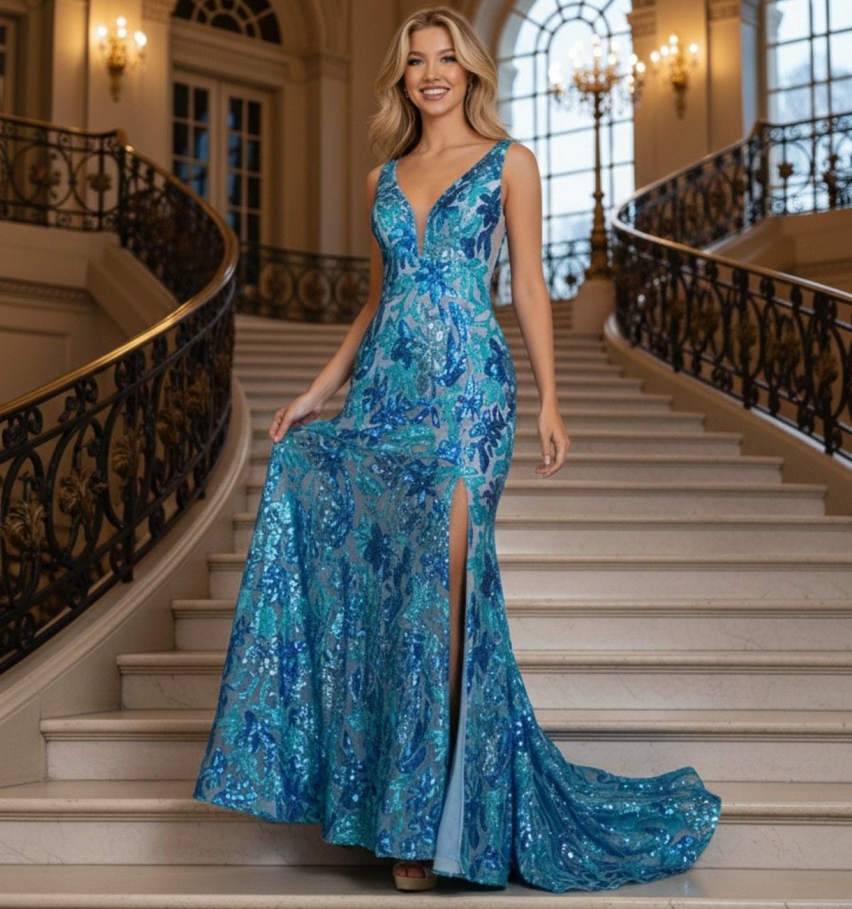
A prom dress that changes color is a real category rather than a gimmick, and a two-tone sequin gown is the version most people meet first. It solves the problem of choosing between two shades. Ombre gowns transition gradually from one shade into another down the skirt, which gives visible depth even in a still photograph. Two-tone sequins show one color flat and another when the sequin flips, so the dress shifts as you move. Iridescent and shot fabrics change with the angle of the light rather than with movement.
The practical caution is that all three photograph differently from how they look in a fitting room. Take a video rather than a still when you try one on, because the effect only shows in motion.
Matching a shade to your coloring
Skin tone narrows the field rather than deciding for you. The quickest check is the vein test at your inner wrist, where blue or purple suggests cool undertones and jewel shades such as sapphire, emerald and true red, while green suggests warm undertones and coral, gold and warm reds. If you cannot tell, you are likely neutral and most shades work.
Beyond that, contrast is what matters. A shade close to your own skin tone is what causes the washed-out look, not a shade that is too bold, which is why beige is riskier on fair skin than emerald is. Our full guide to prom dress colors for different skin tones works through fair, olive, tan, brown and mixed complexions individually.
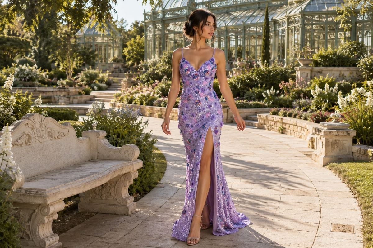
Prom dress colors for blondes, brunettes and redheads
Hair is the second largest block of color next to your face, so it shifts the balance of the whole look even when the shade suits your skin.
Blonde hair keeps the overall picture light, which means the dress usually needs to supply the contrast. Deep navy, emerald and a strong red all work well. Blush, champagne and soft gold can leave light hair, fair skin and a pale dress reading as one continuous tone in photographs, so if you want a soft shade, choose one with enough saturation to separate from your hair.
Brunettes have the widest range because dark hair already provides contrast. Jewel tones hold their own against it, and lighter shades such as ivory, blush and icy blue work equally well since the hair does the separating.
Red hair is the one case with a genuine restriction. Forest green, emerald and deep teal are outstanding against it, and warm neutrals such as champagne and bronze also work. Bright orange and warm tomato red sit too close and compete rather than complement, so a deep rust is the safer route if you want warmth.
Eye color is a smaller effect but useful as a tiebreaker. Emerald and cobalt bring out brown eyes, silver and cool pinks lift blue eyes, and gold or copper tones make green and hazel eyes more noticeable.
How fabric changes the same color
Prom dresses colors are set as much by the material as by the dye, and two gowns in an identical shade can look entirely different depending on what they are made of, which is why an online swatch is close to useless for deciding.
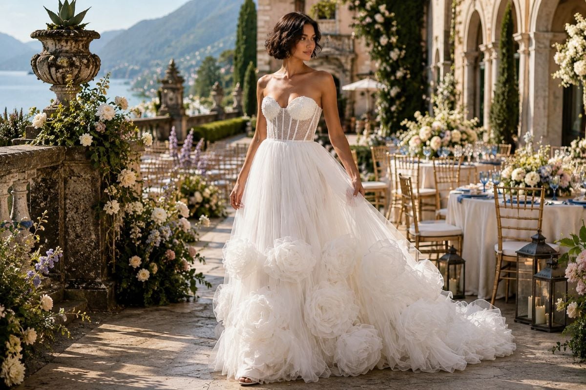
A satin finish reflects light and deepens a color, so emerald and burgundy gain richness in satin that they lose in a matte fabric. Chiffon softens and lightens whatever it carries, which suits pastels but can dilute a bold shade. Tulle adds volume and reads lighter than the same color in a smooth fabric. Brocade and jacquard give a plain shade texture and depth without changing the color at all. Choosing fabric and shade together is what stops a color reading differently from how you pictured it.
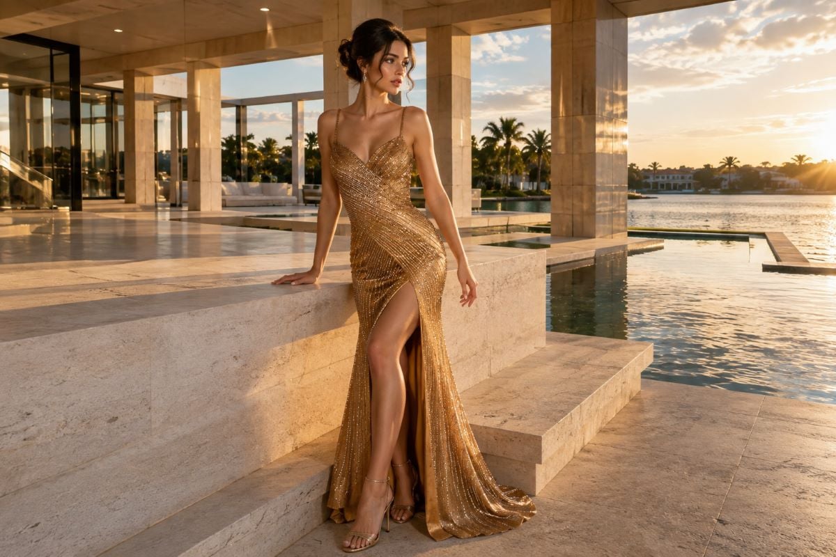
Choosing between two shades you both like
When you cannot separate two colors, four checks settle it faster than more browsing. Photograph yourself in both with the flash on and then off, because that gap is where most surprises live and it is the single most useful test available.
Then look at where each shade sits against your hair rather than only your face, since that is what a full-length photograph shows. Consider the venue lighting next, as a warm ballroom and a bright gym flatter different ends of the range. Finally, ask which one you keep returning to after leaving the store, because that answer tends to be more reliable than anything decided in a fitting room mirror.
Prom Dress Color Questions
What is the most popular prom dress color?
Black is the most chosen, because it suits every complexion and never reads as out of place. Red follows for presence and photographs, then blue across its full range from sky to navy, then emerald green. Pink, burgundy, silver and gold make up most of the remainder at a typical prom.
What color should I wear to prom if I want to stand out?
Choose a shade that is uncommon rather than simply bright. Espresso brown, deep teal, rust, dusty sage and periwinkle all appear rarely and photograph well. If you prefer a popular color, change the fabric or silhouette instead, since an emerald in brocade reads differently from an emerald in satin.
How do I pick prom colors for a whole friend group?
Use one color family in different depths rather than an identical shade for everyone. Navy, sapphire, cornflower and ice blue photograph as a considered group, while four identical dresses photograph as a uniform. Agree the family first and let each person choose their own depth and silhouette within it.
What colors suit blonde, brunette and red hair?
Blonde hair keeps the picture light, so deep navy, emerald and strong red give the contrast a pale shade cannot. Brunettes have the widest range, since dark hair supplies contrast for both bold and light dresses. Red hair pairs beautifully with forest green and teal but competes with bright orange and warm red.
Are color changing prom dresses a good idea?
They work well if you want depth without heavy embellishment. Ombre transitions between shades down the skirt, two-tone sequins shift as the sequin flips, and iridescent fabrics change with the light angle. All three look different in motion than in a still, so take a video rather than a photograph when you try one on.
Why does a color look different in every store?
Lighting and fabric are the reasons. Showroom lighting runs warmer than daylight and much warmer than a phone flash, so a shade shifts across all three. The same color also behaves differently in satin, chiffon, tulle and sequin. Check any dress in natural light and photograph it with the flash both on and off.
Seeing shades in person before deciding
No screen shows color accurately, and no chart accounts for the specific version of a shade in front of you. Trying on one pastel, one jewel tone, one metallic and one neutral tells you more in twenty minutes than a week of scrolling.
Shortlist a few shades before you go, since arriving with a plan makes the appointment far more productive than browsing the full rack.
Then take that shortlist to an authorized Jovani retailer, stand near a window if there is one, and photograph each option with the flash on and off before you decide.