Blog
The Ultimate Guide to Choosing a Mother of the Bride Dress Color
The moment your daughter announces her engagement, a beautiful whirlwind of joy, anticipation, and meticulous planning begins. Amidst the endless venue tours, floral arrangement discussions, and cake tastings, a deeply personal and significant milestone approaches for you: finding the perfect attire for one of the most important days of your family’s life. As the mother of the bride, your presence sets a tone of grace, dignity, and celebration. Naturally, one of the first and most frequent questions that arises during this exciting process is: what color should the mother of the bride dress be? This is not a decision to be made lightly or rushed at the last minute. It is a detail that carries significant visual weight, as your gown will be featured in cherished family photographs for generations, greeting guests as a co-host, and setting a standard of elegance for the entire event.
Choosing the right hue involves much more than simply picking a favorite shade out of a catalog. It requires a thoughtful, sophisticated balance of tradition, modern wedding etiquette, your personal style, your unique complexion, and the overarching aesthetic of the wedding celebration. For decades, Jovani has stood at the forefront of luxury evening wear, engineering garments that celebrate the dignity, beauty, and individuality of mothers. Through our extensive work with authorized boutiques and high-end retailers across the nation, we understand the emotional and stylistic nuances of this selection process better than anyone. We believe that every mother deserves to look and feel her absolute best, radiating a quiet, confident glamour. This comprehensive guide will explore every facet of color selection in deep detail, ensuring you feel perfectly attuned to the celebration and undeniably elegant.
The Evolution of Mother of the Bride Color Etiquette
To truly understand how to select the perfect hue for your daughter’s wedding, it is incredibly helpful to look at how mother of the bride color etiquette has evolved over the years. Historically, the rules surrounding what mothers should wear were incredibly rigid and, frankly, somewhat restrictive. Decades ago, mothers were subtly encouraged to fade entirely into the background. They were often steered toward muted, matronly shades—such as pale beige, washed-out mauve, or dull grey—that frequently lacked personality, minimized their presence, and did little to flatter their natural beauty. The overarching societal expectation was that the mother should be present but virtually invisible in the fashion sense.
Today, the landscape of bridal fashion and American wedding culture has beautifully and dramatically evolved. Mothers are no longer expected to blend into the wallpaper; they are rightfully celebrated as key figures of honor, co-hosts, and matriarchs of the family. Their attire now reflects this elevated, distinguished status. Modern mothers are boldly embracing rich colors, luxurious fabrics, and striking silhouettes that highlight their personal style and sartorial confidence. However, while the rules have relaxed, a few foundational principles remain intact to ensure visual harmony on the wedding day. Familiarizing yourself with proper modern etiquette will help you navigate this newfound freedom while remaining deeply respectful of the couple’s vision.
The Foundational Rule: Navigating Bridal Whites and Ivories
The most widely accepted, enduring, and universally understood rule in wedding fashion is to avoid colors that rival or distract from the bride. Pure white, ivory, stark champagne, and pale alabaster are typically reserved solely for the woman walking down the aisle. Even if you find a stunning, age-appropriate gown in one of these shades, it is generally best to steer clear unless the bride has explicitly requested an all-white wedding party—a highly specific trend made popular by royal weddings and modern minimalist aesthetics.
The reasoning behind this rule goes far beyond simple tradition or outdated superstitions; it is fundamentally about photography, lighting, and visual focus. In a photograph, the human eye is naturally and instantly drawn to the lightest color in the frame. If the mother of the bride is wearing white, she inadvertently competes with the bride for the viewer’s immediate attention in every single group portrait. Furthermore, different shades of white can clash horribly in person and on camera. An ivory gown might make a pure white wedding dress look dingy or stark in comparison. To maintain the bride’s standout moment and ensure flawless photography, it is always safest and most respectful to explore the vast remainder of the color spectrum.
The Modern Renaissance of Dark Hues
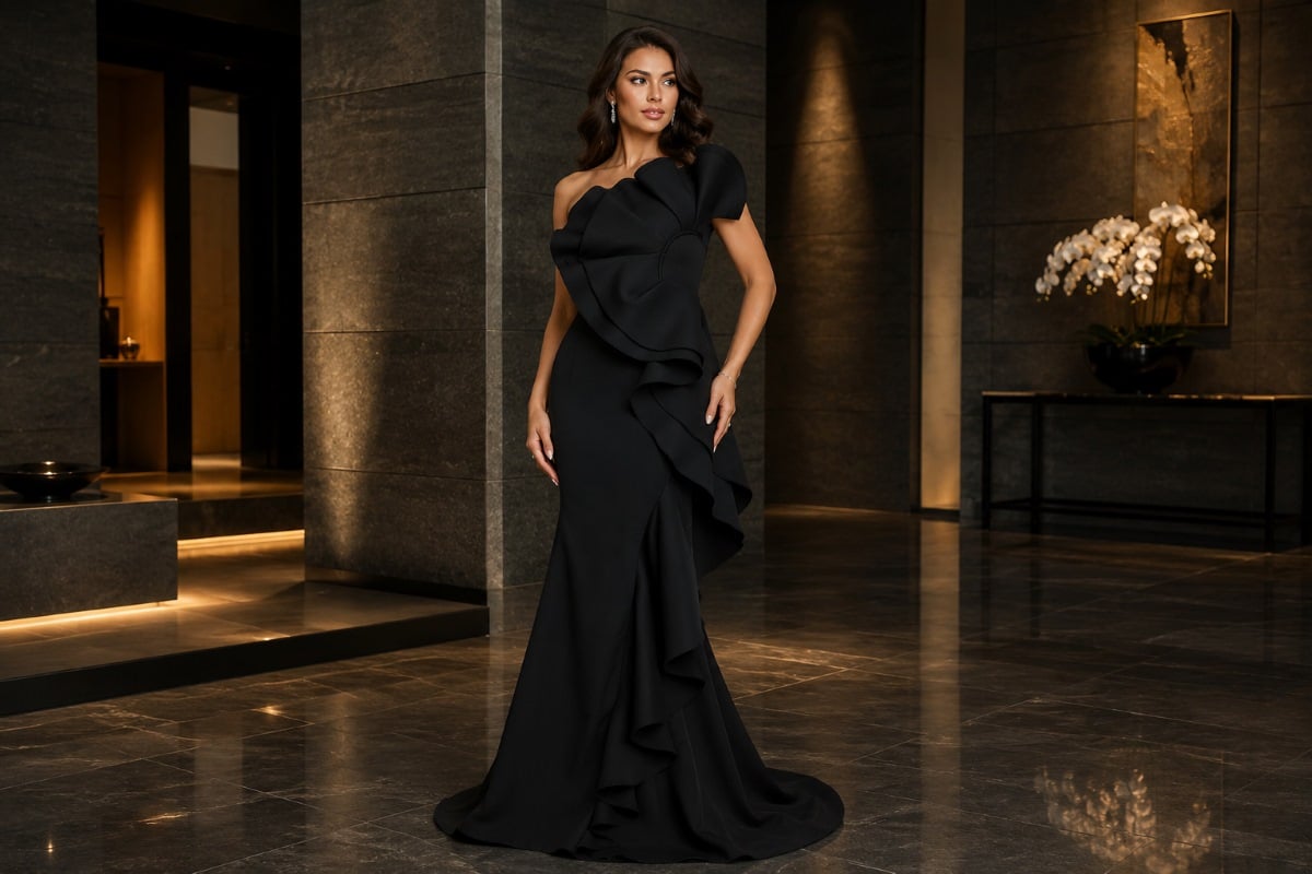
Historically, dark colors—particularly pure black—were considered taboo for weddings, associated more with mourning or somber events than joyous celebrations. This outdated notion has undergone a complete modern renaissance in the luxury fashion world. Today, many mothers wonder if dark, sophisticated hues are appropriate for wedding festivities. If you find yourself asking can the mother of the bride wear black, the contemporary answer in the high-end fashion industry is a resounding yes, provided it aligns beautifully with the formality, venue, and time of the event.
For a black-tie, highly formal, or evening wedding, black is universally flattering, inherently chic, and entirely acceptable in modern wedding culture. It exudes a sharp New York sensibility and pairs magnificently with high-end diamond or pearl jewelry. Black dresses also serve as a spectacular canvas for intricate beadwork or textural fabrics like velvet. If pure black feels too severe or heavy for your personal taste, midnight navy, deep charcoal, and rich espresso offer the exact same slimming, formal properties with a slightly softer, more approachable edge. These dark hues provide incredible contrast in photos, grounding the image and allowing the bride’s lighter gown to truly shine.
Decoding the Wedding Color Palette for Visual Harmony
When trying to figure out what color should the mother of the bride dress be, the most logical and effective starting point is the wedding color palette itself. A beautifully executed wedding is a visual symphony, where every single element, from the table linens to the floral centerpieces and bridal party attire, works in seamless harmony. Your attire is an integral, highly visible part of this overarching aesthetic.
However, a very common misconception is that aligning with the palette means matching it exactly. Your ultimate goal is to coordinate beautifully without looking like an extension of the bridesmaids. If you wear the exact same color and fabric as the bridal party, you risk blending into the background rather than standing out as a distinguished, unique guest of honor.
Tonal Dressing and Sister Shades
A highly sophisticated, fashion-forward approach to matching the bridal party is to utilize tonal dressing, choosing “sister shades” or elegant variations within the same overall color family. This creates a cohesive, highly intentional look in family portraits while allowing you to maintain your individuality and elevated status.
For example, if the bridesmaids are wearing a light, airy sage green, the mother of the bride might look breathtaking in a deep forest green or a rich, saturated emerald. If the bridal party is outfitted in soft blush pink, the mother could confidently opt for a sophisticated dusty rose, a deep magenta, or a regal plum. This variation in depth and saturation creates stunning visual dimension in group photos. The lighter colors advance toward the lens, while the darker, richer colors ground the image, resulting in spectacular, magazine-worthy wedding photography.
Drawing Inspiration from Accent Colors
Couples rarely design a modern wedding around a single, isolated color. They usually develop a primary color and several secondary or accent colors, often including a neutral or a luxurious metallic. Drawing inspiration from these accent shades is a brilliant, subtle way to ensure your gown feels connected to the event without blending into the bridal party. For instance, if the wedding colors are navy blue and gold, wearing a gold or champagne gown allows you to perfectly complement the theme while standing distinctly apart from the navy-clad bridesmaids.
Deep Dive: Universally Flattering Dress Colors
While fleeting fashion trends come and go with each passing season, certain colors have proven to be universally flattering and eternally appropriate for the matriarch of the family. These classic, enduring hues offer a sense of refined confidence and work beautifully across a wide variety of venues, seasons, and formalities.
The Power of Navy and the Blue Spectrum
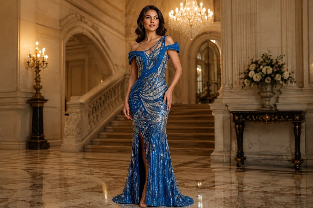
Navy is arguably the most popular and frequently requested choice for mothers of the bride across the country, and for excellent reason. It acts as the ultimate, sophisticated neutral in formalwear. It offers the sleek, visually slimming, and highly formal properties of black, but because it contains a hint of warmth, it casts a softer, more approachable glow onto the skin. Navy flatters virtually every skin tone, from the fairest porcelain to the deepest bronze, and it complements silver, blonde, brunette, and red hair beautifully.
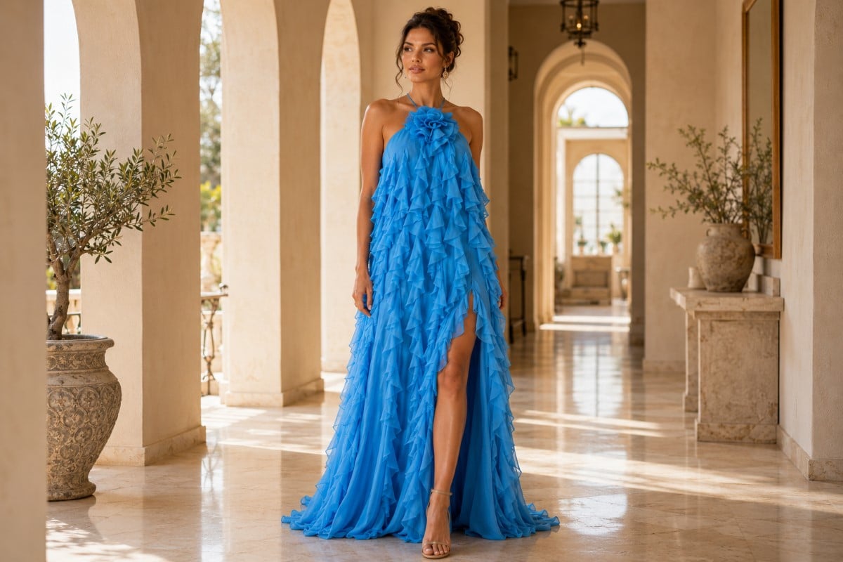
Beyond standard navy, the entire blue spectrum offers incredible versatility. Deep sapphire brings a jewel-toned richness that is absolutely perfect for autumn and winter, while lighter, dusty blues and soft periwinkles are exceptional for spring garden parties. Exploring the diverse range of blue mother of the groom gowns allows you to find the exact level of saturation that makes your natural features pop and perfectly aligns with the wedding’s mood. Blue naturally conveys trust, stability, and elegance—all beautiful sentiments for a mother to project on such a monumental day.
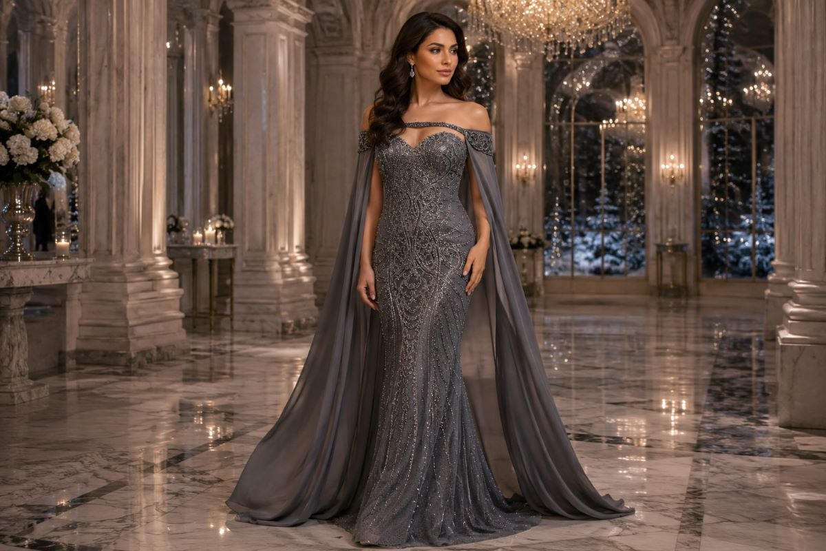
The Luminous Sophistication of Metallics
For mothers who wish to exude high-end glamour and elegance without committing to a bold, highly saturated color, metallics are unparalleled. Metallic fabrics—whether achieved through woven lamé, intricate hand-beadwork, or delicate sequin embellishments—catch the ambient light beautifully. This creates a subtle luminescence that acts almost like a built-in ring light, illuminating your complexion and adding a healthy, radiant glow to your face in both daylight and evening settings.
Selecting silver mum of the bride gowns offers a cool, crisp, and icy elegance. Silver pairs magnificently with winter wonderland themes, modern industrial-chic venues, and black-tie ballroom affairs. On the other end of the metallic spectrum, warm tones like bronze, copper, rose gold, and champagne are spectacular for golden-hour autumn celebrations or rustic-luxe vineyard weddings. When wearing metallics, Jovani’s renowned design expertise truly shines. The sheer quality of our fabrics and beadwork dictates how the light is reflected, ensuring the metallic finish looks inherently luxurious, expensive, and refined, rather than overwhelming or excessively flashy.
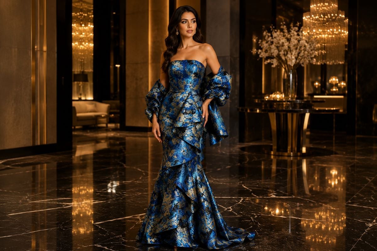
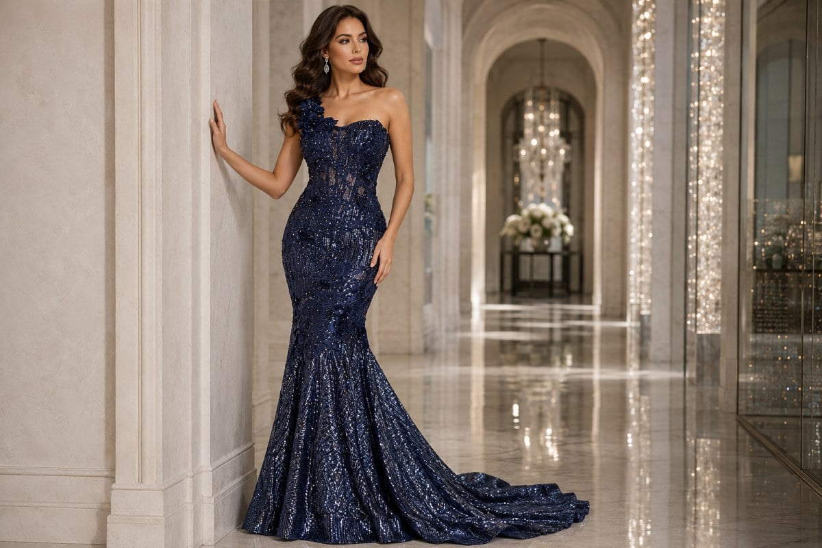
The Regal Nature of Jewel Tones
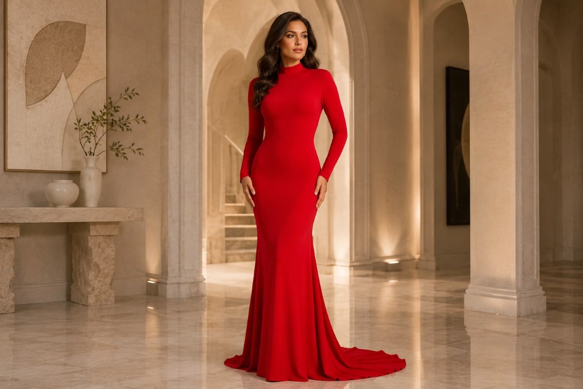
Jewel tones—colors derived from precious gemstones—are magnificent choices for mothers seeking a commanding, confident, and unforgettable presence. Think of rich ruby red, deep amethyst purple, striking emerald green, and vibrant sapphire. Because these colors are deeply saturated, they naturally convey a high level of formality and luxury. Jewel tones are particularly spectacular for evening weddings and are widely considered some of the most flattering mob dress colors for women looking to make a tasteful yet striking statement.
Finding the Right Hue for Your Unique Complexion
To definitively answer what color should the mother of the bride dress be for your specific situation, you must undergo an honest, careful assessment of what flatters your unique physical features. The most intricately designed, expensive couture dress in the world will only serve you well if the color of the fabric illuminates your natural complexion. Wearing a color that clashes with your skin can cast shadows, highlight fatigue, and diminish your natural glow. The secret to unlocking your best colors lies in understanding your skin’s undertones, which generally fall into three primary categories: warm, cool, or neutral.
Identifying Your Skin Undertone
A quick, reliable way to determine your undertone is to look at the veins on the inside of your wrist in natural, bright sunlight.
- If your veins appear slightly greenish, you likely have warm undertones.
- If your veins appear bluish or purple, you likely have cool undertones.
- If you cannot clearly tell whether they are green or blue, or if they appear to be a mix of both, you likely have neutral undertones.
Another excellent method is the jewelry test: if bright gold jewelry makes your skin look bright, healthy, and glowing, you lean warm. If silver, platinum, or white gold makes your skin look refreshed and vibrant, you lean cool.
Best Colors for Warm Undertones
Mothers with warm undertones—often characterized by skin that tans easily, with beautiful hints of peach, yellow, or golden hues—look absolutely radiant in earthy, sun-baked, and autumn-inspired shades. Rich chocolate browns, warm marigolds, olive and moss greens, terracotta, and deep corals will beautifully highlight your natural warmth. You should generally avoid icy pastels or stark, cool jewel tones, which can wash out your complexion and make the skin appear tired or dull.
Best Colors for Cool Undertones
Conversely, mothers with cool undertones—characterized by fair skin that may burn easily, with delicate hints of pink, red, or bluish hues—look spectacular in clear, crisp colors and cool-based jewel tones. Icy blues, stark silvers, vibrant fuchsias, true emerald greens, and deep plums will make cool complexions look vibrant, refreshed, and highly defined. Earthy tones like mustard, rust, or warm orange may clash with the pink undertones in your skin, so it is best to stick to colors with a strong blue base.
Best Colors for Neutral Undertones
If you are fortunate enough to have neutral undertones, meaning you have a balanced mix of warm and cool traits, you have the incredible flexibility to wear nearly any color on the spectrum successfully. In this case, your focus should shift away from complexion matching and focus entirely on selecting the absolute best colors based purely on the wedding theme, the venue aesthetics, and your own personal stylistic preferences.
The Intersection of Color, Fabric, and Silhouette
In the world of high fashion and evening wear, color does not exist in a vacuum. It is fundamentally tied to the physical fabric it is dyed into and the architectural silhouette it forms. The physical properties of a fabric drastically alter how a color is perceived by the human eye, meaning your color choice must be made in tandem with your fabric and fit choices.
How Fabric Dictates Color Perception
Lightweight, translucent fabrics interact with dye very differently than heavy, opaque fabrics. For a romantic, ethereal aesthetic, choosing chiffon mother of the bride dresses allows light to pass through the layers. When a color like burgundy is dyed into chiffon, it creates a softer, more muted, and distinctly airy appearance. Conversely, when that exact same burgundy dye is applied to a heavy Duchess satin, a plush velvet, or a crisp taffeta, the fabric absorbs and reflects the light differently, resulting in a color that is deeply saturated, intense, and highly dramatic. The texture of the fabric can either amplify or soften the visual impact of your chosen hue.
Silhouette and Color Impact
Furthermore, the way a color drapes across your figure in a specific silhouette can highlight your favorite features and provide an incredible sense of confidence. For mothers seeking a classic, universally flattering shape that balances proportions effortlessly, the cut of the gown is critical. Exploring a-line mum of the groom dresses allows you to see how this timeless, sweeping cut creates a narrow waist and smoothly skims over the hips. Because an A-line skirt uses more yardage of fabric, the color you choose will make a much more significant visual impact as you move gracefully throughout the room.
Balancing Modesty with Rich Hues
Additionally, personal style requirements often dictate color choices. Many women prefer garments that offer more physical coverage without sacrificing high-end style or sophisticated glamour. When looking for modest mom of the bride gowns, you will find that solid, rich, uninterrupted colors often enhance the elegance of higher necklines and longer sleeves. A solid color prevents a modest, full-coverage garment from looking overly busy or overwhelming the wearer’s frame. Darker solid colors naturally recede, creating a beautiful, elegant smoothing effect that celebrates your presence with unparalleled grace.
Venue and Seasonal Influences on Color Selection
The physical setting of the wedding plays a massive role in answering what color should the mother of the bride dress be. A heavy hue that looks breathtaking in a dimly lit, candlelit ballroom might feel oppressive and entirely out of place on a sun-drenched beach in mid-July. Adapting your color to the environment shows impeccable taste and sartorial awareness.
Spring and Summer Celebrations
Warm-weather weddings call for colors that beautifully reflect the vibrancy, lightness, and optimism of the season. Think of botanical gardens, coastal resorts, elegant outdoor country clubs, or breezy vineyard patios. During these warmer months, brighter, softer shades like coral, periwinkle, soft mint, lavender, and dove grey are exceptional choices. The physical environment heavily influences the fabric choice as well. Summer weddings demand highly breathable fabrics like georgette, tulle, and chiffon, which naturally lend themselves to these lighter, more ethereal color palettes.
Autumn and Winter Weddings
As the weather cools, wedding palettes naturally and beautifully transition toward richer, more grounded, and highly saturated hues. Autumn weddings, set against the backdrop of changing foliage or in rustic-chic barns, are the absolute perfect setting for warm tones like terracotta, mustard, deep plum, rust, and forest green. These colors harmonize beautifully with the natural landscape.
Winter weddings, particularly those held in grand indoor venues, historic mansions, or luxury hotels, are ideal for the drama of deep, saturated colors. Midnight blue, black, charcoal, crimson, and heavy, shimmering metallics reign supreme in the winter. The fabrics used in cooler months, such as stretch velvet, heavy crepe, and intricate brocade, have a heavier weight and a tighter weave, giving these darker shades an incredible depth, richness, and formal appeal.
The Impact of Lighting on Dress Color
An often-overlooked aspect of color selection is how lighting will affect your gown throughout the event. Wedding celebrations usually transition through several lighting environments: bright afternoon sunlight for the ceremony, golden hour for family portraits, and dim, romantic lighting for the evening reception.
If your dress is a soft pastel, it will look incredibly vibrant and true to color outdoors but may wash out or look white under the flash of a camera indoors. Conversely, a very dark dress might look stunningly rich in the sunlight but could lose its intricate details in a dimly lit reception hall. It is always recommended to view your dress fabric in both natural daylight and artificial lighting at the boutique to ensure you are entirely happy with how the color behaves under different conditions.
Coordinating Beautifully with the Mother of the Groom
Another crucial element of modern mother of the bride color etiquette involves clear communication and familial harmony. Tradition firmly dictates that the mother of the bride acts as the lead and selects her dress color and style first. This is a respectful nod to her role as the primary co-host of the event and the mother of the woman getting married.
Once she has made her choice, it is a necessary, highly appreciated gesture of goodwill to communicate this selection directly to the mother of the groom. This ensures that both mothers complement one another in family photographs without clashing horribly or inadvertently showing up wearing the exact same shade. The goal is elegant coordination, not matching. For example, if the mother of the bride chooses a deep, majestic navy blue, the mother of the groom might look lovely in a cool silver, a slate grey, or a soft dusty blue. Sharing actual fabric swatches or detailed photos of the dress is highly recommended to ensure everyone feels confident, respected, and visually cohesive on the big day.
Jovani’s Unwavering Commitment to Mothers
Selecting your attire for your daughter’s wedding is a deeply emotional, monumental experience, and the brand you choose should reflect the absolute importance of this life occasion. Jovani does not simply manufacture dresses; we engineer premium garments that empower women to feel their absolute best. Our approach to mother of the bride attire focuses heavily on impeccable tailoring, luxurious fabrics, and an innate, decades-long understanding of exactly how a woman wants to feel on her daughter’s wedding day.
We firmly believe that to truly know what color should the mother of the bride dress be, you cannot simply look at a computer screen; you must experience the drape of the fabric, the sparkle of the beadwork, and the richness of the dye in person. Because Jovani distributes exclusively through authorized boutiques and premium retailers across the globe, finding a Jovani gown is a highly curated, hands-on luxury experience. Our highly trained retail partners are fully equipped to guide you through our extensive collections, ensuring the color you choose looks just as magnificent under the boutique’s lighting as it will sparkling under the chandeliers on the dance floor. Jovani’s commitment to quality ensures that whether you select a soft pastel chiffon or a dramatic, heavily beaded jewel tone, the color will be vibrant, enduring, and flawlessly executed.
FAQ’s About Choosing Your Gown’s Shade
1. Do I have to match the bridesmaids perfectly?
No, it is highly recommended that you do not match the bridesmaids perfectly. Wearing the exact same shade and fabric can cause you to visually blend into the bridal party in photographs, which diminishes your distinguished role. Instead, opt for a coordinating “sister shade,” a rich metallic, or an elegant neutral that complements the overall palette.
2. Are there any colors I should strictly avoid?
Yes. The most steadfast rule is to avoid the bride’s color—meaning pure white, ivory, or pale champagne. Additionally, fashion experts suggest avoiding neon colors or overly loud, chaotic prints that could easily pull focus away from the couple in your family portraits.
3. How do I know what color should the mother of the bride dress be if I want to wear a pattern?
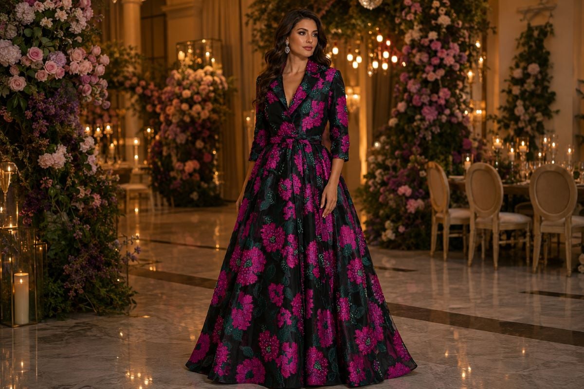
Patterned dresses are wonderful for daytime or outdoor weddings, provided the pattern is sophisticated and elegant. Look for subtle watercolor florals on chiffon, delicate jacquard weaves, or refined embroidery. Ensure the dominant colors within the pattern pull directly from the wedding’s established color scheme for a cohesive look.
4. Should the venue affect my color choice?
Absolutely. The venue sets the formality of the event. A grand, historic ballroom calls for rich jewel tones, deep darks, or heavy metallics. A relaxed beachside resort or daytime botanical garden is much better suited for light pastels, soft aquas, blush pinks, and warm corals.
5. When is the best time to purchase my dress?
Luxury bridal experts advise beginning your search 6 to 8 months before the wedding and making your final purchase 4 to 6 months out. This gives you plenty of time to coordinate colors with the mother of the groom and allows ample time for professional tailoring.
Deciding on your attire is a beautiful sartorial journey that celebrates your family’s incredible milestone, and we invite you to visit an authorized Jovani retailer today to discover the perfect gown that makes you feel absolutely extraordinary.